
Anime


Generation Data
Records
Prompts
Copy
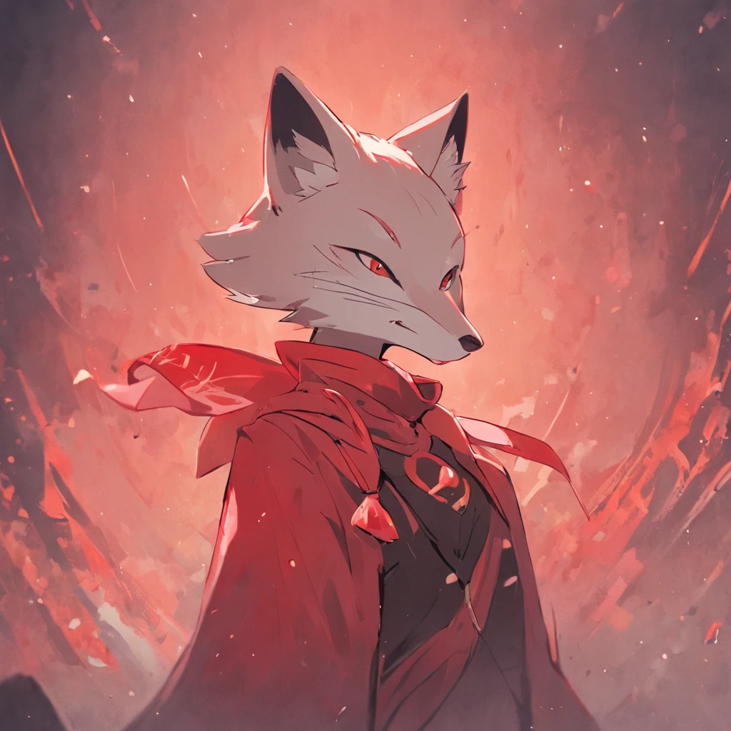
The logo for the company "Kikira" is an elegant representation of a fox with a red scarf
.
It is designed with the purpose of being practical for any type of business while exuding sophistication
.
The fox symbolizes intelligence
,
adaptability
,
and resourcefulness
,
traits that are highly sought after in the business world
.
The fox in the logo is depicted in a sleek and minimalistic style
,
with clean lines and smooth curves
.
Its body is gracefully poised
,
with a sense of confidence and poise
.
The red scarf around the fox's neck adds a touch of color and character to the logo
,
symbolizing warmth
,
energy
,
and passion
.
The overall color scheme of the logo is inspired by pinkish tones
,
creating a subtle and feminine touch
.
Soft shades of pink
,
such as blush or rose
,
are used to convey elegance
,
sophistication
,
and a sense of charm
.
These colors also evoke emotions of tenderness and approachability
,
making the logo inviting and appealing
.
The typography chosen for the company name
,
"Kikira
,
" complements the logo's aesthetic
.
It is elegant
,
yet simple
,
with clean lines and balanced proportions
.
The font is carefully selected to be legible and memorable
,
ensuring that the company's name is easily recognizable
.
In summary
,
the logo for "Kikira" is an elegant representation of a fox with a red scarf
.
Its minimalistic design
,
pinkish color scheme
,
and carefully chosen typography create a logo that is practical
,
versatile
,
and exudes elegance
.
This logo perfectly encapsulates the essence of the company and is sure to leave a lasting impression on its customers
.
INFO
0 comment
1
3
0
SeaArt Swift AI Apps
AI Video Generation
Unleash your imagination and let AI create visual wonders for you
Face Swap Online Free
Create funny or realistic face swap videos & photos in a snap
AI Filters
Turns every photo into a work of art
Anime to Reality
Instantly bring your favorite anime characters to life.
Gender Swap
Swap genders in photos and videos with SeaArt's AI gender swapper. Enjoy fun and realistic transformations effortlessly, free online!
Wan 2.1 Image to Video
Animate photos with realistic motion and cinematic effects.
Explore More AI Apps