
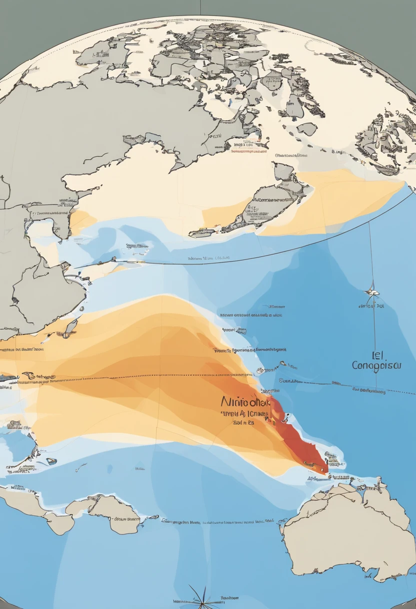
Arafed map of the world with a red line indicating the temperature of the ocean


Generation Data
Records
Prompts
Copy
Claro
!
COME ON
!
In the video
,
we can illustrate the El Niño phenomenon visually and explain its climatic consequences
.
We can start by showing a map of the Equatorial Pacific Ocean
,
highlighting the region where El Niño occurs
.
Em seguida
,
We can show an animation that represents the warming of the waters in this region
,
explicando que
,
during or El Niño
,
the waters of the Equatorial Pacific Ocean get warmer than normal
.
We can also show an animation that illustrates the changes in atmospheric circulation patterns caused by El Niño
.
Podemos representar as correntes de ar se deslocando de forma diferente do usual
.
Regarding climate consequences
,
podemos ilustrar cada uma delas separadamente
.
Por exemplo
,
We can show a thermometer rising to represent rising temperatures
.
We can also show a map with different colors representing the areas affected by rising temperatures during El Niño
.
Para as chuvas
,
We can show charged clouds and raindrops falling in different regions
,
to illustrate that El Niño can cause heavier rainfall in some areas and drought in others
.
Ademais
,
We can highlight the impact of El Niño on agriculture
.,
showing wilted and dry crops to represent the lack of rainfall and the difficulty of cultivation during this phenomenon
.
No geral
,
The goal is to use visual elements
,
as animations
,
Maps and simulations
,
to explain in a clear and visually appealing way what the El Niño phenomenon is and what its climatic consequences are
.
INFO
0 comment
0
0
0
SeaArt Swift AI Apps

AI Video Generation
Unleash your imagination and let AI create visual wonders for you

Face Swap Online Free
Create funny or realistic face swap videos & photos in a snap

AI Filters
Turns every photo into a work of art

Change the Person in the Photo
Easily replace the person in any photo with AI.

Studio Ghibli Filter
Transform any photo into unique Ghibli-style art in just one click.
AI Image Fusion
Combine two images into new one stunning visual with AI Image Fusion.
Explore More AI Apps