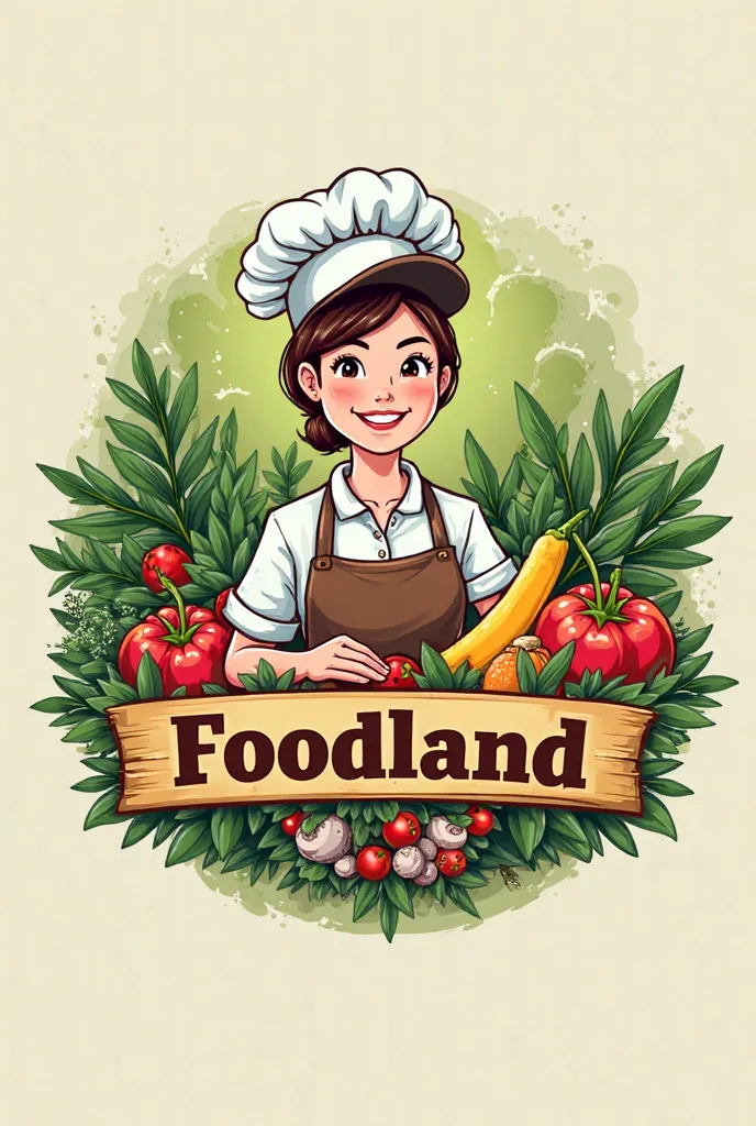
Para criar um logotipo para o curso de Food Engineering, here is an idea you mig
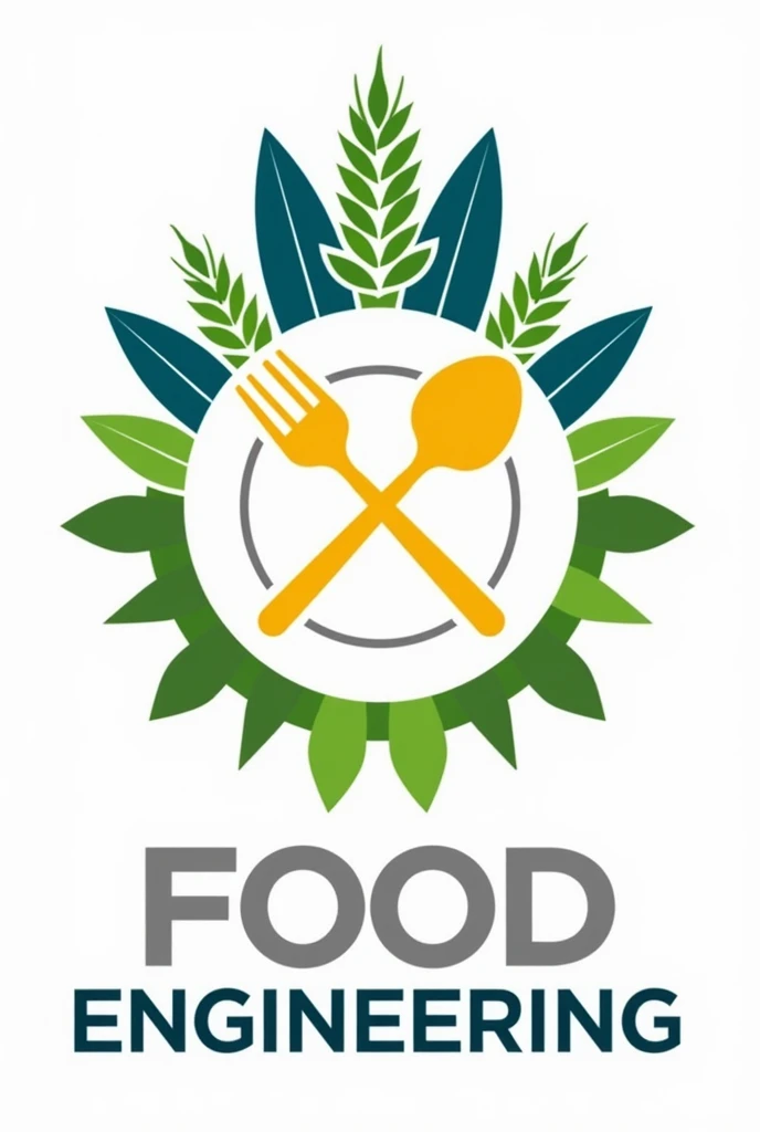


Para criar um logotipo para o curso de Food Engineering, here is an idea you might consider:conceito:The logo can be a combination of elements that symbolize food science, technology and sustainability, reflecting the values and focus of the course.Description:Central symbol:A gear (representing engineering and technology) stylized as a plate, where each gear tooth merges with food symbols (For example, Wheat, litter, AngelT, and a drop of oil). Isso conecta a ideia de engenharia com a produção e transforlittero de alimentos.Folhas Unripes:Wrapping the top of the gear, add green leaves to represent sustainability and eco-friendly practices, reinforcing the idea of sustainable innovation in the food sector.Crossed Spoon and Fork:Positioned behind the gear, as a background, symbolizing the preparation and consumption of food, linking the theoretical and practical aspects of the course.colors:Use the colors mentioned above:Unripe (#4CAF50) for the leaves.cerulean (#2196F3) for gear contour.yellow (#FFEB3B) for food symbols.gris (#9e9e9e) for the utensils and technical details.Typography:The name of the course "Food Engineering" can be placed below the symbol in a modern, readable font, perhaps with a slight tilt to add dynamism. Using a sans-serif font with clean lines can convey modernity and clarity..
Generation Data
Records
Prompts
Copy
Para criar um logotipo para o curso de Food Engineering
,
here is an idea you might consider:conceito:The logo can be a combination of elements that symbolize food science
,
technology and sustainability
,
reflecting the values and focus of the course
.
Description:Central symbol:A gear (representing engineering and technology) stylized as a plate
,
where each gear tooth merges with food symbols (For example
,
Wheat
,
litter
,
AngelT
,
and a drop of oil)
.
Isso conecta a ideia de engenharia com a produção e transforlittero de alimentos
.
Folhas Unripes:Wrapping the top of the gear
,
add green leaves to represent sustainability and eco-friendly practices
,
reinforcing the idea of sustainable innovation in the food sector
.
Crossed Spoon and Fork:Positioned behind the gear
,
as a background
,
symbolizing the preparation and consumption of food
,
linking the theoretical and practical aspects of the course
.
colors:Use the colors mentioned above:Unripe (#4CAF50) for the leaves
.
cerulean (#2196F3) for gear contour
.
yellow (#FFEB3B) for food symbols
.
gris (#9e9e9e) for the utensils and technical details
.
Typography:The name of the course "Food Engineering" can be placed below the symbol in a modern
,
readable font
,
perhaps with a slight tilt to add dynamism
.
Using a sans-serif font with clean lines can convey modernity and clarity
..
INFO
Checkpoint & LoRA

Checkpoint
SeaArt Infinity
#Food
#SeaArt Infinity
0 comment
1
0
0
SeaArt Swift AI Apps

AI Video Generation
Unleash your imagination and let AI create visual wonders for you

Face Swap Online Free
Create funny or realistic face swap videos & photos in a snap

Disney Filter
Instantly transform your photos into Disney characters.

AI Dance Video Generator
Play with this AI dance video generator, unleash your inner dancer instantly!

Anime to Reality
Instantly bring your favorite anime characters to life.

AI Kissing Video Generator
Turn photos into realistic kissing videos in seconds.
Explore More AI Apps