🧠 How to Use Thinking Mode in GPT Image 2 for Flawless Infographics and UI Mockups
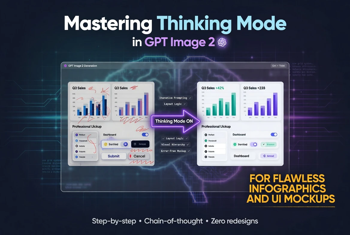
Have you ever tried to generate an infographic or an app mockup with AI, only to get garbled text, overlapping icons, and layouts that make no sense? That frustration ends here. GPT Image 2 on SeaArt.ai includes a feature called Thinking Mode, a built-in reasoning pass that plans your entire image before a single pixel is rendered. The result is clean text, accurate spacing, and layouts that actually look like a human designer made them.
In this guide, you will learn exactly how Thinking Mode works, how to activate it on SeaArt, and how to write prompts that produce professional infographics, UI mockups, diagrams, and marketing visuals. You will also get ready-to-use prompt examples you can paste directly into the generator.
🔍 What Is Thinking Mode?
Thinking Mode is a pre-generation reasoning pass that runs inside GPT Image 2 before the model starts drawing. Think of it as the model sketching a blueprint in its head first.
During this pass, the model does three things:
- Plans visual hierarchy. It decides which elements are largest, which sit on top, and how the viewer's eye should travel across the composition.
- Structures multi-object scenes. It maps out where each icon, text block, chart, and shape will sit so that nothing overlaps unless you ask it to.
- Verifies spatial relationships. It checks its own plan against your prompt constraints before rendering, catching errors like misaligned columns or cut-off labels early.
"Thinking Mode is not a separate tool you install. It is baked into GPT Image 2's architecture. When you write a detailed, structured prompt, the model automatically engages its reasoning pass to handle complexity."
The practical benefits are impressive. English text renders at roughly 99% character-level accuracy. Scenes with 10 to 20 distinct objects stay clean and free of occlusion. And the model performs self-verification against your prompt constraints, meaning it checks its own work before handing you the final image.
⚙️ How to Activate Thinking Mode on SeaArt
You do not need to flip a hidden switch. Thinking Mode activates automatically when you use GPT Image 2 on SeaArt.ai and provide a well-structured prompt. Here is how to set things up:
- Open SeaArt.ai and navigate to the AI image generator.
- Select GPT Image 2 as your model from the model picker.
- Write a detailed, structured prompt using natural sentences instead of keyword spam. The more specific your layout instructions, the more deeply the reasoning pass engages.
- Set a fixed Seed value if you want consistency across multiple generations. This lets you refine your prompt while keeping the same basic composition.
- Generate your image and review the output. Use iterative refinement to adjust any details.
📐 The Prompt Structure Template
GPT Image 2 prefers natural, descriptive sentences over comma-separated keyword tags. Organize your prompts using this five-part template:
- Subject / Goal - What is the image? An infographic, a mobile app screen, a flowchart?
- Layout / Composition - How are elements arranged? Columns, rows, circular flow, Z-pattern?
- Style / Medium - Flat design, glassmorphism, corporate clean, hand-drawn sketch?
- Environment / Lighting - Background color, gradient direction, light source for 3D elements?
- Quality / Technical Cues - Resolution hints, render quality, anti-aliasing preferences?
Remember: parentheses around a keyword like (bold header) increase its prominence in the output, while square brackets around a keyword like [subtle watermark] decrease it. Use these controls sparingly for fine-tuning.
📊 Creating Infographics with Thinking Mode
Infographics are where Thinking Mode truly shines. The model needs to place headlines, sub-sections, icons, statistics, and small body text all in one coherent layout. Without reasoning, this usually falls apart. With Thinking Mode engaged, the model plans every zone of the canvas before rendering.
Tips for Infographic Prompts
- Wrap every text string in quotation marks. Write "Step 1: Research" instead of just Step 1 Research. This tells the model to treat it as literal text to render.
- Specify text placement separately. Instead of saying "an infographic with stats," say "the number '87%' appears in large bold font at the center of section two."
- Describe the grid. Tell the model how many columns and rows you want, and what goes in each cell.
Prompt Example 1 - Nutrition Facts Infographic:
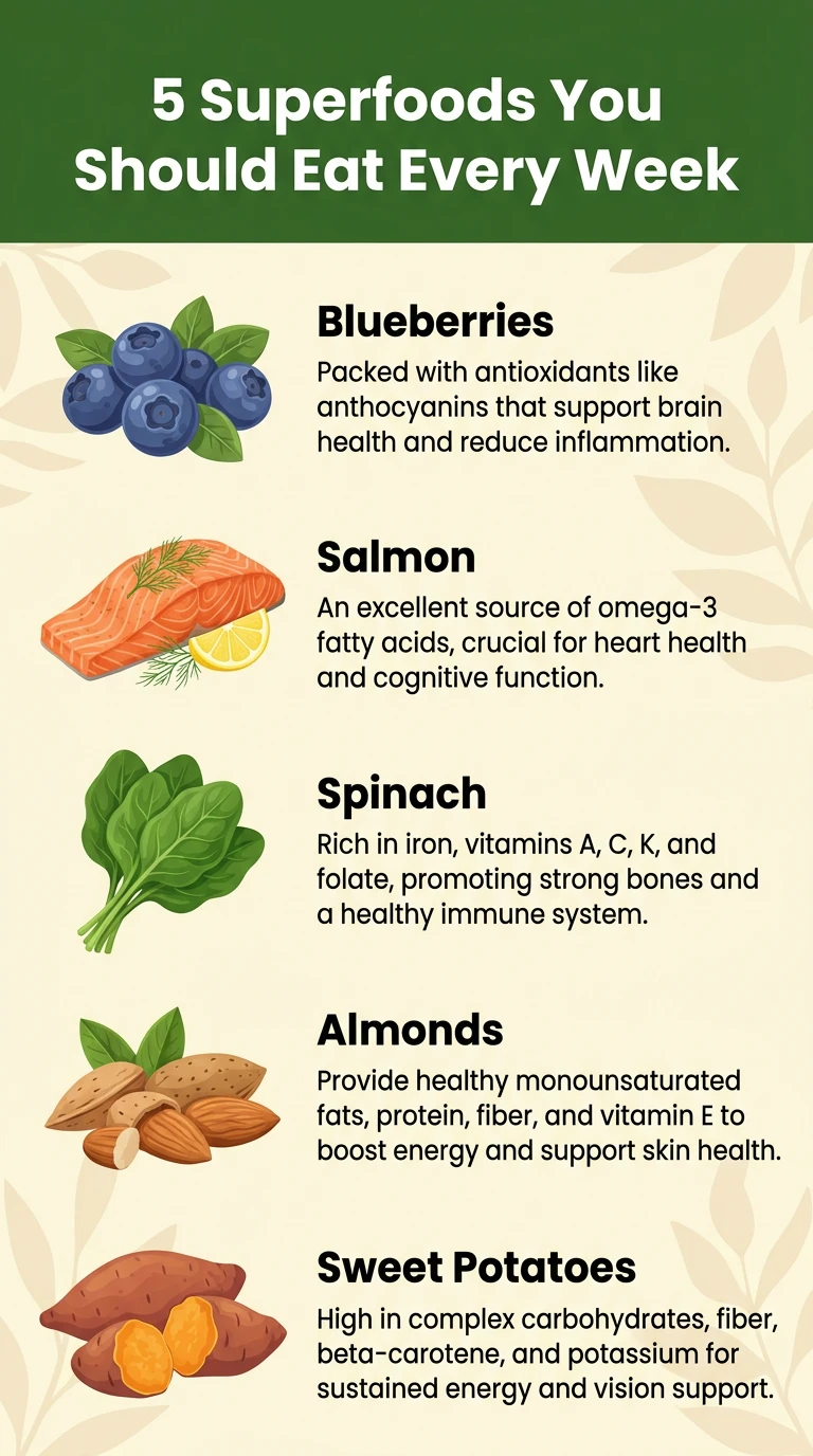
A tall vertical infographic titled "5 Superfoods You Should Eat Every Week" in bold white text on a dark green banner at the top. Below the title, five horizontal rows are evenly spaced. Each row contains a realistic illustration of one food item on the left (blueberries, salmon, spinach, almonds, sweet potatoes) and two lines of text on the right: the food name in bold sans-serif and one sentence about its health benefit in smaller regular font. The background is a soft cream color with subtle leaf patterns. Flat design style, clean vector look, high resolution, no overlapping elements.
Prompt Example 2 - SaaS Metrics Dashboard Infographic:
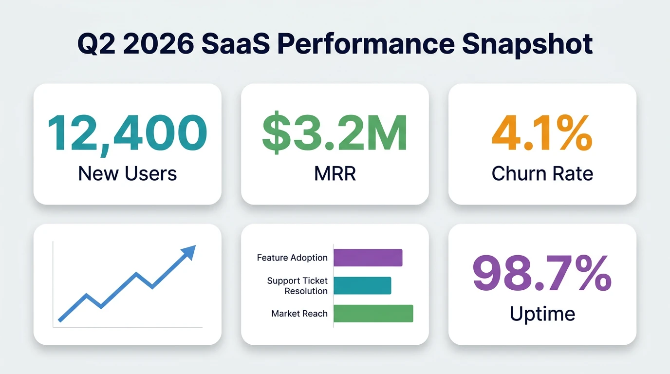
A modern landscape-oriented infographic titled "Q2 2026 SaaS Performance Snapshot" centered at the top in bold dark navy text. The layout is divided into a 2x3 grid of cards on a light gray background. Each card has a white rounded-rectangle container with a soft drop shadow. Card one shows a large "12,400" in teal with the label "New Users" below. Card two shows "$3.2M" in green with the label "MRR" below. Card three shows "4.1%" in orange with the label "Churn Rate" below. Card four has a simple upward-trending line chart in blue. Card five has a small horizontal bar chart with three colored bars. Card six shows "98.7%" in purple with the label "Uptime" below. Corporate clean style, sans-serif typography throughout, 4K resolution detail.
📱 Designing UI Mockups with Thinking Mode
UI mockups require pixel-perfect alignment, consistent spacing, and readable text at small sizes. Thinking Mode handles this by pre-calculating the spatial grid before rendering elements.
Tips for UI Mockup Prompts
- Name the device frame. Say "iPhone 15 screen" or "desktop browser window at 1440px wide" so the model knows the aspect ratio and frame style.
- Describe the UI hierarchy. Start from the top: status bar, navigation bar, content area, bottom tab bar. The model follows your ordering.
- Use design system language. Terms like "rounded corners at 12px," "16px padding," and "8px gap between cards" give the reasoning pass concrete spatial data to work with.
Prompt Example 3 - Mobile Fitness App Screen:
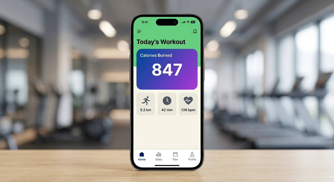
A UI mockup of a mobile fitness app displayed inside an iPhone 15 frame. The screen has a white background. At the top, a navigation bar shows the text "Today's Workout" in bold black, centered, with a small hamburger menu icon on the left and a bell icon on the right. Below the nav bar, a large rounded card with a gradient from deep blue to purple displays the text "Calories Burned" in white at the top-left and the number "847" in extra-large bold white font at the center. Below the card, three smaller square tiles in a horizontal row show: a running icon with "5.2 km," a clock icon with "42 min," and a heart icon with "138 bpm." Each tile has a light gray background with rounded corners. At the bottom, a tab bar with four icons: Home (filled), Stats, Plan, Profile. Flat modern UI style, clean vector, crisp text rendering.
Prompt Example 4 - Desktop Dashboard for Project Management:
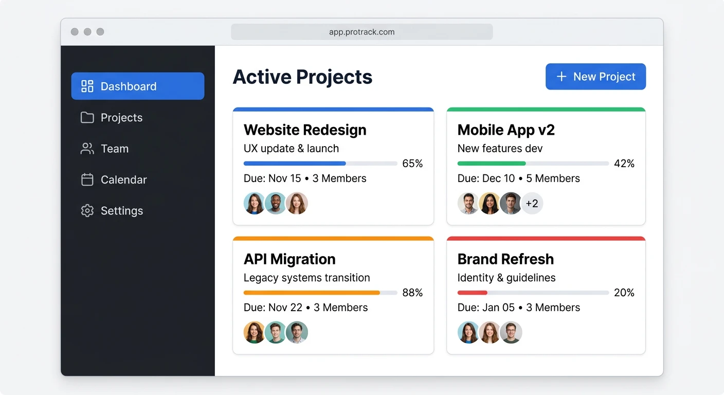
A UI mockup of a desktop web application for project management, shown inside a minimalbrowser window frame with a light gray title bar. The left sidebar is dark charcoal, 240pxwide, with white text links: "Dashboard," "Projects," "Team," "Calendar," and "Settings," each preceded by a small icon. "Dashboard" is highlighted with a blue background pill. The main content area has a white background. At the top, a header row shows the text "Active Projects" in bold on the left and a blue "New Project" button with a plus icon on the right. Below the header, four project cards are arranged in a 2x2 grid. Each card has a white background, subtle border, a colored top stripe (blue, green, orange, red), a project name in bold ("Website Redesign," "Mobile App v2," "API Migration," "Brand Refresh"), a progress bar showing a different percentage, and a row of three small circular avatar thumbnails at the bottom. Modern SaaS design style, Inter or similar sans-serif font, clean spacing, no overlapping elements, high-fidelity mockup quality.
📈 Building Diagrams and Marketing Visuals
Beyond infographics and UI screens, Thinking Mode handles flowcharts, process diagrams, comparison graphics, and social media ad creatives. The key is to describe the flow or hierarchy in plain language so the reasoning pass can map out the connections.
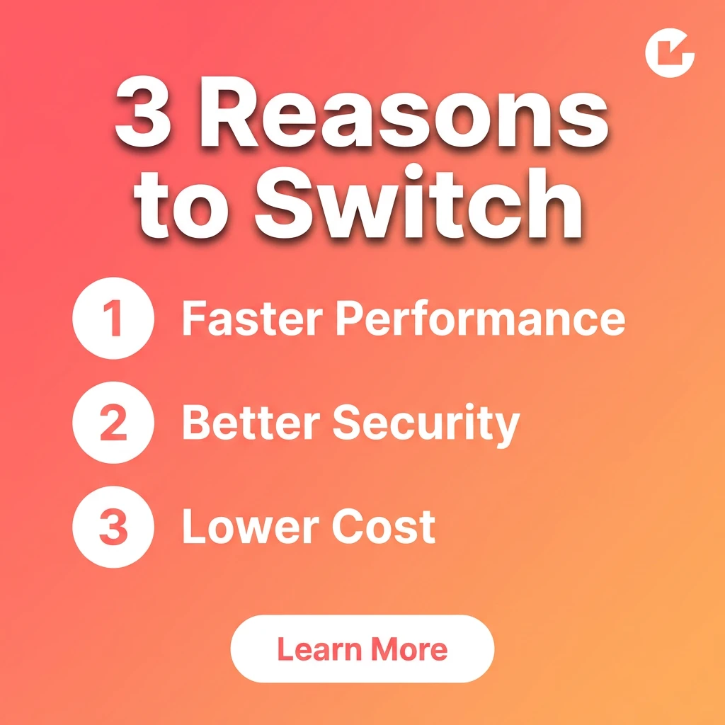
Prompt Example 5 - Instagram Carousel Ad Slide:
A square social media ad slide for an Instagram carousel. The background is a smooth gradient from coral pink at the top-left to warm peach at the bottom-right. At the top, the text "3 Reasons to Switch" is displayed in large bold white sans-serif font with a subtle drop shadow. Below the headline, three numbered items are stacked vertically with generous spacing. Each item has a white circle with the number inside ("1," "2," "3") on the left, and a short phrase on the right in white text: "Faster Performance," "Better Security," "Lower Cost." At the bottom center, a white rounded pill button reads "Learn More" in coral pink text. The company logo, a small simple geometric mark in white, sits in the top-right corner. Modern marketing visual style, bold and punchy, high contrast text, mobile-optimized readability, 1080x1080 pixels.
💡 Best Practices for Getting Perfect Results
Here are practical tips to help you get the most out of Thinking Mode with GPT Image 2 on SeaArt:
- Always use quotation marks around text strings. Writing "Sign Up Free" in your prompt tells the model to render those exact characters. Without quotes, the model might paraphrase or skip words.
- Specify text and visuals separately. Describe the icon first, then describe the label beneath it in a separate sentence. This helps the reasoning pass assign distinct regions.
- Lock your Seed for iteration. Pick a Seed number and keep it fixed while you tweak your prompt. This way, the overall composition stays stable while you refine details.
- Use parentheses and brackets strategically. If a headline keeps rendering too small, wrap it in parentheses like (large bold headline text). If a background element is too prominent, wrap it in square brackets like [subtle grid pattern].
- Write in natural sentences, not keyword lists. GPT Image 2 parses meaning from sentence structure. "A bold red headline sits at the top of the card" works better than "bold, red, headline, top, card."
- Limit yourself to 10 to 20 distinct objects. Thinking Mode handles this range comfortably without occlusion. If your design needs more than 20 separate elements, consider splitting it across multiple images.
- Refine in stages. Start with a prompt that describes the overall layout. Once you are happy with the structure, add detail about typography, colors, and small icons in a second pass.
- Describe spatial relationships explicitly. Instead of "icons near the text," write "the icon is centered 16 pixels to the left of the label text." Concrete spatial language gives the reasoning pass more to work with.
✅ Conclusion
GPT Image 2's Thinking Mode on SeaArt.ai changes the way you approach AI-generated design work. By running a reasoning pass before rendering, it plans visual hierarchy, structures complex multi-object scenes, and verifies spatial relationships, all before touching a single pixel. The result is infographics with readable text, UI mockups with aligned components, flowcharts with proper connections, and marketing visuals with crisp typography.
The key to great results is writing prompts that give the reasoning pass enough information to work with. Use the five-part template: Subject, Layout, Style, Environment, and Quality cues. Wrap text strings in quotation marks. Describe your grid and spacing in concrete terms. Lock your Seed for iterative refinement.
Whether you are a designer prototyping app screens, a marketer building social media assets, or a content creator assembling data visuals, Thinking Mode gives you a reliable way to generate production-quality layouts without fighting garbled text and broken compositions. Open SeaArt.ai, select GPT Image 2, and start building. #advertisement #render #Product Design