A close up of a circular display of electronic devices
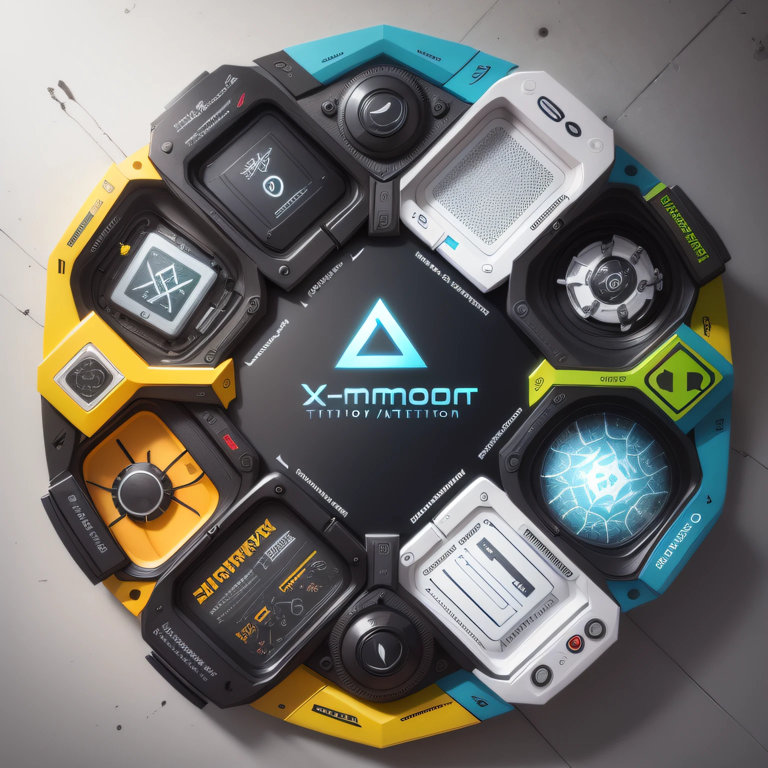


The XcommandStudio logo consists of simple geometric shapes,There are two main elements。The central element is an X-shaped pattern,Four small triangles of different colors surround the four corners of X。The whole design is dominated by black and white,The color of each small triangle is a vivid blue、green color、amarelo e vermelho。 The design is inspired by the concept of technology and innovation。The X-shaped pattern represents crossover、Junctions and connections,Symbolizes the core value of XcommandStudio as a technology company:Provide customers with cross-disciplinary solutions through technology and innovation。The four small triangles represent creativity、Change and diversity。They not only represent XcommandStudio's expertise in different areas,Also expressed the company in technology、designs、Diversification capabilities in marketing and innovation。The bright colors symbolize the vitality and original intention of the company,It also attracts attention,Make the logo more distinctive and unique。The entire design uses simple geometry,Modernity and professionalism are highlighted。
Подсказки
Копировать подсказки
The XcommandStudio logo consists of simple geometric shapes
,
There are two main elements
。
The central element is an X-shaped pattern
,
Four small triangles of different colors surround the four corners of X
。
The whole design is dominated by black and white
,
The color of each small triangle is a vivid blue、green color、amarelo e vermelho
。
The design is inspired by the concept of technology and innovation
。
The X-shaped pattern represents crossover、Junctions and connections
,
Symbolizes the core value of XcommandStudio as a technology company:Provide customers with cross-disciplinary solutions through technology and innovation
。
The four small triangles represent creativity、Change and diversity
。
They not only represent XcommandStudio's expertise in different areas
,
Also expressed the company in technology、designs、Diversification capabilities in marketing and innovation
。
The bright colors symbolize the vitality and original intention of the company
,
It also attracts attention
,
Make the logo more distinctive and unique
。
The entire design uses simple geometry
,
Modernity and professionalism are highlighted
。
Информация
Checkpoint & LoRA
Checkpoint
ReV Animated
#Игра
#Портрет
#ancient
0 комментариев
0
0
0
SeaArt: Удобные AI Apps

Генерация видео с помощью ИИ
Освободите своё воображение, и ИИ создаст для вас визуальные чудеса

Бесплатная онлайн смена лица
Быстро создавайте забавные и реалистичные видео и фотографии с изменением лица

Фильтр Studio Ghibli
Превратите любую фотографию в уникальное искусство в стиле Ghibli всего за один клик.

Смена пола
Поменяйте пол на любой фотографии с потрясающим реализмом

Видео замена лица
Создавайте забавные видео, заменяя лица в любом видеоклипе.

AI фильтры.
Делайте каждое фото произведением искусства.
Исследовать больше AI-приложений