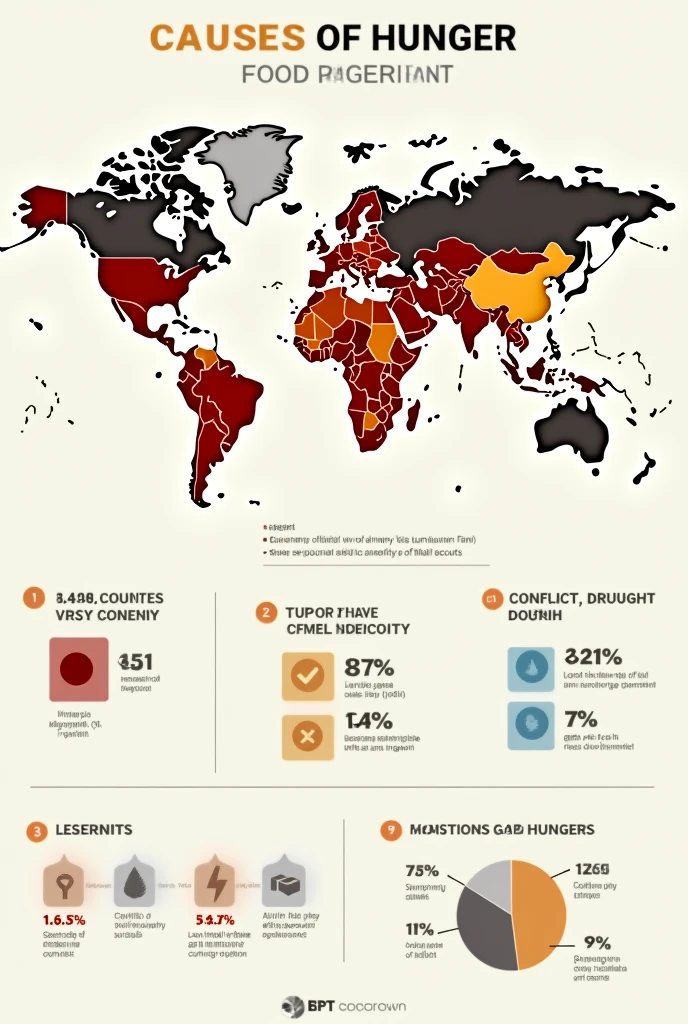
Create a detailed infographic-style image showing a global map with color

創作參數
記錄
提示詞
復製
Create a detailed infographic-style image showing a global map with color-coded regions representing the levels of hunger across different countries
.
The map should include a legend that explains the severity of hunger
,
with darker colors indicating higher levels of food insecurity
.
The infographic also features key statistics
,
such as the percentage of the population affected by hunger in each region
,
alongside icons that represent the main causes (e
.
g
.,
conflict
,
drought
,
poverty)
.
Include a small inset bar chart comparing the top 10 countries most affected by hunger
.
The overall design should be clean
,
informative
,
and visually engaging
,
making complex data easy to understand at a glance
.
信息
模型 & 風格

模型
SeaArt Infinity
#SeaArt Infinity
共 0 條評論
0
0
0


