Image generation tips

Video Creation
 【SeaArt Movies】Video Editing TutorialIn this video, Fera talks about the features of working in the SeaArt Movies editor, as well as the 10 principles of editing.The full text of the tutorial:Hi, I found a really cool thing I want to tell you about!In my opinion, the most convenient part is that everything is gathered in one place! Which means you can work fast.You should start with an idea. Whatever we come up with, whatever tools we use, everything will be built on it.And to better structure the whole design of our concept, you can use a trick: the help of an AI assistant, right there at hand, inside the app itself.This powerful tool will help keep you from losing your train of thought and save time, instantly adapting your idea into a ready-made script.I recommend starting our work by uploading or creating references of our characters and locations.This is a very important step that shouldn't be skipped.Let's use a right-click to add our characters right into SeaArt Movies, so we can then use their sketches an unlimited number of times to create works.Now we can ask the assistant to draw sketches — let's make it 9 frames. We'll place them on a single image to save time and make things clearer.And then we simply connect the tails of all our modules to the input of the chosen video model. We can write our prompt directly in the video generation module, or connect the previously created text module that the AI generated at our request. In many modern models, you can simply specify the reference number to refer to it.And then all that's left is to enjoy the finished film. Good references very clearly convey all the distinguishing features of the characters.As the first step, we prepare the references, then we transform our idea into a script. Of course, creating a storyboard isn't strictly necessary, but it can help you picture the final result and avoid risk when working with expensive models. Personally, I prefer to prepare a few key individual frames, and then combine everything into one long video.For convenience, such a text module can be used for recurring descriptions of style, characters, and setting across an entire series of works at once, as long as you have enough resource cells available for the video.Well then, let's move on to the most interesting part — namely, editing. The built-in editor lets you perform basic operations on the fragments of your film. Besides quickly trimming a video with a single button, you can open the editing mode with a whole range of tools.Connect blocks with video, images, and audio, which will automatically be added to the editor's library, so you can then use them in the edit across multiple tracks.The editor makes it easy to trim and crop video fragments, overlay audio and images, as well as add effects and transitions between scenes.But in what order is it best to show our scenes? Since this is an educational video, I think it's worth mentioning the ten principles of editing.The first is editing by shot size. A video sequence is well perceived when shots of different sizes are joined together. However, this "jump" shouldn't be too big: connecting a close detail with a wide view would look unharmonious.Shots connect best as wide, then medium, then detail, then long, another medium, then close-up. Such schemes become intuitive if you look closely at this moment in films.The second is editing by orientation in space. Filming two interacting objects must be done strictly from one side of their line of interaction. If a character moves and crosses the axis — the camera must also move and switch to the other side of the axis.The third is editing by the direction of movement of the main object in the frame. If an object moves right — in the next frame it shouldn't start moving left. Any change in movement must be shown through an intermediate frame.The fourth is editing by the phase of moving objects in the frame. Anything that moves cyclically and is shot in several sequential shots must be edited with respect to the phases of the cycle, creating the impression of continuity of movement and action.The fifth is editing by the tempo of moving objects. During the movement of an object at a certain speed, when the shot size changes, it feels as if the object's movement has changed. This happens because the object starts crossing the frame faster or slower, as it is closer/farther away.To keep the object's speed unchanged, besides the shot size, you also need to change the point and angle of the shot.The sixth is editing by frame composition. When the composition of the frame changes, there are limits on shifting the center of attention, which must not shift by more than 1/3 of the frame. Otherwise there will be a jump and the viewer will lose the object.The seventh is editing by light. When joining two shots, the direction and amount of the light flow, as well as the position of shadows, must match. Any sharp changes must be justified by the story.For example, to create drama or to bring something to light.The eighth is editing by color. The essence of editing by color is as follows: if a frame is almost entirely filled with one color, then in the previous frame this color should occupy roughly one third. Otherwise, with a sharp change of background, the viewer might get confused, or such flickering will simply cause them discomfort.Color and light in a frame often set the mood of the whole scene.The ninth is editing by shifting the shooting axes. You must not shoot the next frame while being on the shooting axis of the previous frame.Just like the shot size, you need to change both the shooting axis and the center of attention. These changes also shouldn't be too sharp.You can't simply take and show the same frame from the same angle.And the last, tenth — is editing by the direction of the main moving mass in the frame.A moving object can occupy any part of the frame's area, or even the entire frame. Everything that lies within the silhouette of this object and moves across the screen — is what makes up the moving mass.The directions of the moving masses in adjacent frames must coincide or have close vector values.When editing a frame with a completely static image with a frame that contains a moving mass, this mass must occupy less than one third of the total image area.The speed of the moving masses in adjacent frames must fully match or be close enough, that is, the tempo of movement in one frame should not differ from the tempo of movement in the next.By following these editing principles, the scene will be better read and look more natural to the viewer.Having grasped the rules, don't be afraid to experiment, but always keep your idea in mind. Work on the dramaturgy. Keep an eye on rhythm and tempo. Don't neglect such an important component as sound. Graphics and text also help draw the viewer's attention.Returning to SeaArt Movies. When all the fragments of the future film are ready, it's time to join them together.Unlike the editor, here it's enough to simply add all the elements one by one to the module's input.It will quickly join them into a single cohesive fragment, which can also be edited and added to.Then overlay music on top, by uploading a prepared file or generating the right melody right here on the platform.Add it to the module and check the length, so the melody doesn't loop after it ends.Now all that's left is to watch what we've got. I hope this video was useful to you. Thank you, and see you next time!Thank you for watching! We wish you success in bringing your ideas to life!В этом видео Фера рассказывает об особенностях работы в редакторе SeaArt Movies, а также о 10 принципах монтажа.Полный текст обучающего урока:Привет, я нашла очень крутую штуку, о которой хочу рассказать!Как по мне, самое удобное — что всё собрано в одном месте!А значит, можно работать быстро.Начинать следует с идеи. Что бы мы ни придумали, какие бы инструменты ни использовали, всё будет основываться на ней.И для того чтобы лучше выстроить саму структуру нашей задумки можно воспользоваться хитростью:помощью AI-ассистента, прямо тут же под рукой, в самом приложении.Этот мощный инструмент поможет не сбиться с мысли и сэкономить время, мгновенно адаптируя вашу идею в готовый сценарий.Рекомендую начать нашу работу с загрузки или создания референсов наших персонажей и локаций.Это очень важный шаг который не стоит пропускать.Давайте нажатием правой кнопки мыши добавим наших героев прямо в SeaArt Movies, чтобы затем неограниченное количество раз использовать их эскизы для создания работ.Теперь мы можем попросить ассистента нарисовать эскизы, пусть будет 9 кадров. Разместим их на одном изображении для экономии и наглядности.А после просто подключим хвостики всех наших модулей ко входу выбранной видео-модели.Мы можем написать наш промт сразу в модуле генерации видео или подключить созданный ранее модуль текста, что сгенерировал AI по нашей просьбе.Во многих современных моделях можно просто указать номер референса, чтобы обратиться к нему.Ну а затем останется лишь наслаждаться получившемся фильмом.Хорошие референсы очень чётко передают все отличительные черты персонажей.Первым шагом подготавливаем референсы, затем преобразуем нашу идею в сценарий.Конечно, создавать раскадровку вовсе не обязательно, но это может помочь представить готовый результат чтобы избежать риска при работе с дорогими моделями.Лично мне больше нравится заготовить несколько ключевых отдельных кадров, чтобы затем объединить всё в длинное видео.Для удобства, такой модуль текста можно использовать для повторяющихся описаний стиля, персонажей и обстановки сразу для всей серии работ, если хватает ячеек ресурсов на видео.Что ж, давайте перейдём к самому интересному, а именно - к монтажу.Встроенный редактор позволяет производить базовые операции над фрагментами нашего фильма.Помимо быстрый обрезки видео одной кнопкой, вы можете открыть редактирование с целым рядом инструментов.Подключите блоки с видео, картинками и аудио, которые автоматически будут добавлены в библиотеку редактора, чтобы затем в могли использовать их в монтаже на нескольких дорожках.Редактор позволяет без труда обрезать и кадрировать фрагменты видео, накладывать звук и изображения, а так же добавлять эффекты и переходы между сценами.Но в какой последовательности лучше показывать наши сцены?Раз у нас обучающее видео, думаю будет не лишним упомянуть о десяти принципах монтажа.Первый - это монтаж по крупности.Видеоряд хорошо воспринимается, когда соединяются разные по крупности кадры. Однако, этот «скачок» не должен быть большим: соединение близкой детали с дальним видом будет выглядеть негармонично.Лучше всего планы соединяются как общий, затем средний, затем детальный, дальний, другой средний затем крупный. Подобные схемы будут интуитивно понятны, если вы присмотритесь к этому моменту в фильмах.Второй - это монтаж по ориентации в пространстве.Съёмка двух взаимодействующих объектов должна производится строго с одной стороны от линии их взаимодействия. Если же герой движется и пересекает ось — камера должна тоже двигаться и перейти на другую сторону оси. Третий - это монтаж по направлению движения главного объекта в кадре.Если объект движется вправо — в следующем кадре он не должен начать двигаться влево. Любое изменение движения должно быть показано через промежуточный кадр. Четвёртый - это монтаж по фазе движущихся объектов в кадре.Всё, что движется циклично и снимается несколькими последовательными планами, должно быть смонтировано с соблюдением фаз цикличности, создавая впечатление непрерывности хода движения и действия.Пятый - это монтаж по темпу движущихся объектов.Во время движения объекта с определённой скоростью, при изменении крупности кадра создаётся ощущение, что движение объекта изменилось. Это происходит из-за того, что объект начинает пересекать кадр быстрее или медленнее, так как находится ближе/дальше.Для того, чтобы скорость объекта не изменилась, помимо крупности кадра нужно менять точку и угол съёмки. Шестой - это монтаж по композиции кадровПри изменении композиции кадра, есть ограничения по изменению центра внимания, который не должен изменяться более чем на 1/3 кадра. Иначе будет скачек и зритель потеряет объектСедьмой - это монтаж по свету.При стыковке двух кадров, направление потока и количества света, а также положение теней, должны совпадать. Любые резкие изменения должны быть оправданы сюжетом. Например, для создания драмы или появлением источника.Восьмой - это уже монтаж по цвету.Суть монтажа по цвету заключается в следующем: если кадр практически заполнен одним цветом, то в предыдущем кадре этот цвет должен занимать примерно одну треть. Иначе при резкой смене фона, зритель может запутаться или просто подобное мельтешение вызовет у него дискомфорт.Цвет и свет в кадре часто задают настрой всей сцены.Девятый - это монтаж по смещению осей съемки.Нельзя снимать следующий кадр находясь на оси съёмки предыдущего кадра.Как и крупность кадров, нужно менять и ось съёмки, и центр внимания. Эти изменения также не должны быть слишком резкими. Нельзя просто так взять и показать тот же кадр с того же ракурса.И последний десятый - это монтаж по направлению основной движущейся массы в кадре.Движущийся объект может занимать в кадре любую часть его площади и даже весь кадр целиком. Всё, что находится в пределах силуэта этого объекта и перемещается по экрану — и является движущейся массой.Направления движущихся масс в соседних кадрах должны совпадать или иметь близкие векторные значения.При монтаже кадра с полностью статичным изображением с кадром, в котором имеется движущаяся масса, эта масса должна занимать менее одной трети площади всего изображения.Скорость движения масс в смежных кадрах должна полностью совпадать или быть достаточно близкой, то есть темп движения в одном кадре не должен отличаться от темпа движения в следующем. При соблюдении этих принципов монтажа, сцена будет лучше читаться и выглядеть естественнее для зрителя.Усвоив правила, не бойтесь экспериментировать, но всегда держите в голове свою идею. Работайте над драматургией. Следите за ритмом и темпом. Не пренебрегайте такой важной составляющей как звук.Графика и текст тоже помогают акцентировать внимание зрителя.Возвращаясь к SeaArt Movies. Когда все фрагменты будущего фильма готовы, настало время соединить их вместе.В отличии от редактора, тут достаточно просто поочерёдно добавить все элементы ко входу модуля.Он быстро соединит их в цельный фрагмент, который так же можно редактировать и дополнять.Поверх наложить музыку, загрузив подготовленный файл или сгенерировав нужную мелодию прямо тут на платформе.Добавьте её к модулю и проверьте длину, чтобы мелодия не зациклилась после своего окончания.Теперь осталось только посмотреть то, что у нас получилось. Надеюсь, это видео было вам полезно. Спасибо и до новых встреч!Благодарим за просмотр! Желаем Вам успеха в воплощении самых смелых идей!#Fera #SeaArt Movies #Персонаж #Мультфильм #Kedra
 curious how to make a long take video?
 Achieve Better Video Results with a Good Plan - PART 2
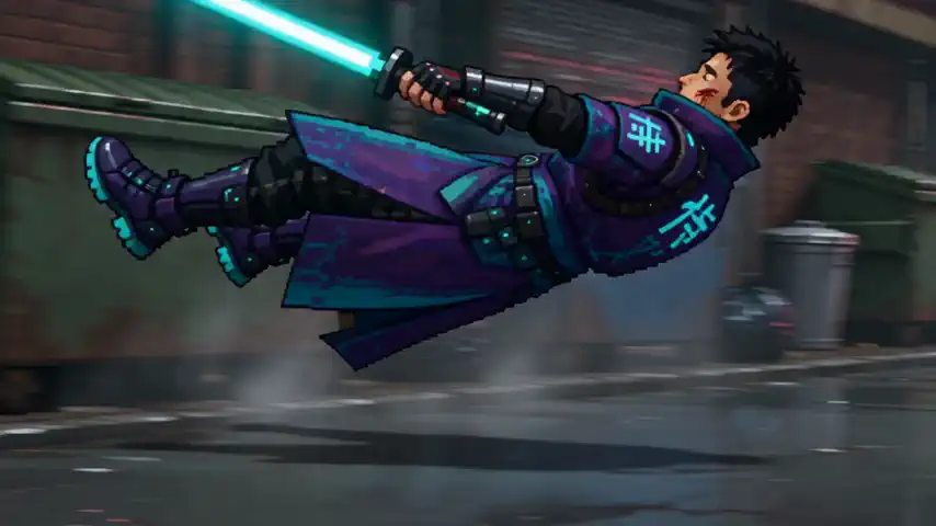 PixelArt 30s Video Template (short tutorial)HELLO,Seaart Movies Short Workflow Tutorials is HERE!USE REMIX TO TRY MY WORKFLOWthe workflow is hybrid that combining image and video1 CHARACTER SHEETShelp you generate 3 characters sheets.with theree steps:A. create realism character sheets (to maintain the consistency)B. upscale it to get better detailsc. change the style to Pixel Art 2 VIDEO GENERATIONconnect the 3 characters that match your scenario settingsmy SKILL will generate the video prompts for you.and enjoy the results.NOTE: THIS SKILL IS ONLY FOR 30s Duration (Good for STARDREAM/SEEDANCE 2.5, but it can be works for WAN3.0/SONO W3)Making short films becomes easier with Seaart Movies. Good luck! #Character #Game #SeaArt Movies #🔥GPT Image 2 #pixel art #stardream2.5 #longvideos
Model usage
 Tomorrow Seedream 5.5
 Wan 3.0 Camera Grammar
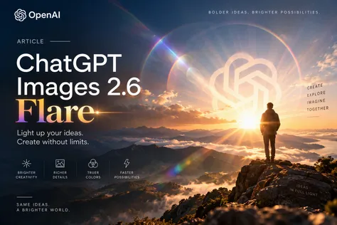 Article About ChatGPT Images 2.6 Flare#advertisement #Article Creator Recruitment #ChatGPT Analisis Lengkap ChatGPT Images 2.6: Modul Sunburst, Flare, dan Panduan Penggunaan AI Generatif VisualPembangunan teknologi kecerdasan buatan (AI) dalam bidang penjanaan imej telah mencatatkan pencapaian penting menerusi pelancaran seni bina berasaskan ChatGPT Images 2.6 oleh OpenAI pada 4 November 2026. Pelancaran ini memperkenalkan evolusi struktur daripada penjanaan imej statik kepada manipulasi visual berasaskan kerumitan terancang, animasi temporal, dan penyuntingan bersasar. Platform ini menyokong beban kerja global yang menjana lebih daripada 4 bilion imej seminggu—bersamaan dengan lebih 500 juta aset visual setiap hari menerusi ChatGPT, Codex, dan titik akhir API pembangun.Dokumen ini menyediakan analisis teknikal dan panduan komprehensif mengenai ekosistem ChatGPT Images 2.6, merangkumi penelitian mendalam terhadap dua enjin utamanya iaitu GPT-Image-2.6 Sunburst dan GPT-Image-2.6 Flare, perbandingan prestasi, kelebihan dan keterbatasan sistem, contoh prompt terstruktur, serta penilaian kesesuaian mengikut sektor industri.1. Pengenalan Kepada ChatGPT Images 2.6ChatGPT Images 2.6 merupakan pusingan naik taraf keupayaan yang mengekalkan kerangka asas siri versi 2.5 tetapi memperkenalkan tiga peningkatan utama dalam pemprosesan visual. Peningkatan tersebut merangkumi pengurangan latensi penjanaan global secara purata sebanyak 50%, pengenalan mod output temporal melalui animasi GIF terbina, dan keupayaan penyuntingan tepat menerusi tindanan penandaan PNG lutsinar (transparent PNG markup overlays).Bagi ekosistem API pembangun, OpenAI memperkenalkan parameter kerumitan (complexity parameter) yang terpisah daripada parameter kualiti visual (quality). Parameter kerumitan mengawal perancangan ruang (spatial planning), penyelesaian kekangan berbilang objek, dan penetapan susun atur tipografi sebelum proses latent diffusion dijalankan. Keupayaan eksport grafik vektor Scalable Vector Graphics (SVG) turut diperkenalkan untuk menyokong keperluan pereka web dan pembangun perisian yang memerlukan aset visual berskala tanpa kehilangan resolusi.2. Apa Itu GPT-Image-2.6 Sunburst?Model dengan pengenal pasti rasmi gpt-image-2.6-sunburst merupakan enjin asas berprestasi tinggi dalam keluarga Images 2.6. Ia direka khas untuk tugasan yang menuntut keperincian mikro (fine micro-detail fidelity) dan konsistensi subjek yang tinggi merentasi pelbagai pusingan penyuntingan (multi-turn editing consistency).Dalam ujian penanda aras industri, versi Sunburst 2.6 menguasai tangga teratas dalam carta DesignArena Image Leaderboard. Ciri-ciri utama enjin Sunburst merangkumi:Konsistensi Subjek Berulang: Memelihara ciri-ciri unik watak, produk, atau logo jenama walaupun imej melalui beberapa fasa penyuntingan teks dan latar belakang.Perincian Tekstur dan Tipografi: Keupayaan tinggi dalam merender teks kecil, huruf timbul, dan tekstur bahan seperti kraf kertas, fabrik, dan cetakan logam.Perancangan Spatial Mendalam: Apabila dipadankan dengan tahap kerumitan tinggi (complexity: high), Sunburst melakukan analisis hubungan antara objek secara terperinci untuk mengelakkan gangguan pertindihan (visual clipping).3. Perbezaan Utama Antara GPT-Image-2.6 Sunburst dan FlareModel gpt-image-2.6-flare direka sebagai enjin berhalaju tinggi (high-velocity engine) yang dioptimumkan untuk iterasi pantas, draf pukal, dan penyesuaian susun atur promosi atau e-dagang. Sebaliknya, gpt-image-2.6-sunburst dioptimumkan untuk ketetapan visual maksimum dan pembetulan imej berperingkat.Jadual di bawah merumuskan perbezaan seni bina dan operasi antara kedua-dua enjin tersebut:Dimensi Prestasi / CiriGPT-Image-2.6 Flare (gpt-image-2.6-flare)GPT-Image-2.6 Sunburst (gpt-image-2.6-sunburst)Fokus Reka Bentuk UtamaPrototip pantas, susun atur poster, draf promosiKeperincian tinggi, konsistensi penyuntingan berulangLatensi Penjanaan Minimum~6 saat (pada tahap quality: low)Dioptimumkan untuk ketepatan (tiada latensi minimum khusus)Pengekalan Identiti WatakSederhana / AsasSangat Tinggi / Terbaik dalam kelasnyaPenyuntingan Berbilang PusinganSesuai untuk pertukaran elemen mudahSesuai untuk pembetulan kompleks dan penceritaanOptimasi Susun Atur PosterDitingkatkan secara khusus melalui layout priorsMenyokong komposisi ruang piawaiFormat Output DisokongPNG, JPEG, WebP, SVG, Animated GIFPNG, JPEG, WebP, SVG, Animated GIFTetapan Kualiti Lalai APImediumhighBerdasarkan garis panduan OpenAI, pembangun perisian disyorkan untuk melancarkan proses reka bentuk menggunakan model Flare pada tahap quality: low dan complexity: high untuk memverifikasi susun atur dan kedudukan teks dalam masa 6 saat, sebelum membuat imbasan akhir menggunakan Sunburst pada tahap quality: high atau max.4. Kebaikan dan Keburukan ChatGPT Images 2.6Sebelum melaksanakan integrasi dalam skala besar, analisis terhadap kelebihan dan keterbatasan sistem Images 2.6 adalah penting untuk mengimbangi kos operasi dan kualiti output.Kebaikan UtamaPeningkatan Kelajuan Penjanaan: Pengurangan masa pemprosesan sehingga 50% berbanding versi 2.5 membolehkan ujian idea dilakukan secara masa nyata.Kepelbagaian Mod Visual: Keupayaan menjana animasi GIF bergelung (looping GIF) dan fail vektor SVG secara langsung menerusi titik akhir API tanpa memerlukan alat luaran.Penyuntingan Tandaan PNG Lutsinar: Membolehkan pengguna melukis bulatan atau tanda pada tindanan PNG lutsinar untuk mengarahkan pembetulan imej secara spesifik.Ketepatan Tipografi Pelbagai Bahasa: Menyokong perenderan teks yang tepat dalam bahasa Melayu, Inggeris, Jepun, Cina, dan Arab dengan kadar pematuhan arahan majmuk melebihi 90%.Kebolehkesanan Digital (Provenance): Setiap imej dilengkapi dengan metadata cryptographic C2PA dan cap air steganografi SynthID daripada Google DeepMind yang tahan terhadap pemotongan (cropping) atau pemampatan fail.Keburukan dan KeterbatasanPerubahan Kos Token Pada Tahap Draf: Walaupun harga asas token kekal sama (30/1M output token), versi 2.6 mengenakan pengganda token output sebanyak 4.2x bagi kualiti rendah (`low`) dan 3.3x bagi kualiti sederhana (`medium`). Ini menyebabkan penjanaan draf kualiti rendah berharga ~0.0247 seisi imej berbanding ~$0.0059 pada siri 2.5.Artefak Pergerakan Pada GIF: Penjanaan animasi GIF fizikal berhalaju tinggi boleh mengalami artefak seperti jelly warping atau kekaburan ruang (spatial blurring) pada pemprosesan vektor pergerakan.Sekatan Endpoint Bagi Vektor SVG: Eksport SVG hanya disokong pada titik akhir penjanaan rasmi (/v1/images/generations) dan tidak menyokong penyuntingan imej (/v1/images/edits) atau streaming data.Had Modulo Dimensi Imej: Dimensi piksel tersuai mesti mematuhi had matematik \text{Dimensi} \pmod{16} = 0, dengan nisbah aspek antara 1:3 hingga 3:1.5. Kelebihan Utama Sistem dan Seni BinaChatGPT Images 2.6 memperkenalkan beberapa inovasi seni bina yang memberikan kelebihan berbanding enjin generatif lain di pasaran:Pengurusan Pemegang Rujukan Berbilang (@Mascot Handles): Siri 2.6 membolehkan pengguna menyimpan profil rujukan watak, haiwan peliharaan, atau produk secara langsung dalam akaun ChatGPT. Dengan menggunakan penanda khas seperti @Mascot atau @ProductSKU, model mengunci identiti visual merentasi pelbagai pusingan sembang tanpa memerlukan fine-tuning model yang mahal.Di samping itu, penyahpasangan (decoupling) antara kawalan kerumitan perancangan (complexity) dan kualiti perenderan piksel (quality) membolehkan pengoptimuman belanjawan API. Pembangun boleh melaraskan kedudukan objek pada kos compute rendah sebelum melakukan perenderan akhir pada tahap kualiti maksimum.6. Panduan dan Contoh Prompt: Daripada Mudah Hingga RumitUntuk mendapatkan hasil optimum daripada ChatGPT Images 2.6, prompt perlu diatur mengikut struktur asas: Subjek + Gaya Visual + Pencahayaan & Atmosfera + Susun Atur/Perspektif + Batasan Khas.Berikut adalah contoh prompt mengikut tahap kesukaran:Peringkat 1: Prompt Mudah (Simple Prompt)Prompt ringkas untuk penjanaan subjek tunggal tanpa kekangan susun atur kompleks.Prompt:"Seekor kucing jingga comel memakai topi tukang masak kecil, duduk di atas meja kayu dapur, gaya lukisan cat air yang lembut, latar belakang kabur."Peringkat 2: Prompt Sederhana (Medium Prompt)Prompt yang menentukan gaya pencahayaan, kanta kamera, dan komposisi atmosfera.Prompt:"Foto fotografi komersial sebuah botol minyak wangi kaca lutsinar dengan cecair berwarna emas. Botol diletakkan di atas batu basalt hitam bersalut embun air. Pencahayaan studio dramatik dari arah sisi, kedalaman medan cetek (shallow depth of field), kanta 85mm, sudut pandangan paras mata, gaya berasaskan realisme tinggi tanpa suntingan berlebihan."Peringkat 3: Prompt Rumit & Majmuk (Complicated Compound Prompt)Prompt terperinci yang menggabungkan elemen Tipografi Tepat, Komposisi Ruang Berlapis, dan Batasan Negatif.Prompt:"Cipta poster iklan fesyen jalanan kontemporari untuk jenama bernama "TERANG". Subjek: Sekumpulan tiga orang remaja berbilang etnik bertenggek di tangga konkrit bandar pada waktu senja. Mereka memakai pakaian streetwear gaya minimum dengan nada warna bumi (earth tones).Pencahayaan & Warna: Pencahayaan lampu neon biru dan oren neon yang dipantulkan pada permukaan jalan basah, suasana sinematik, palet warna berbeza tinggi.Tipografi: Paparkan teks slogan rasmi tepat sekali sahaja di bahagian atas tengah poster dengan font sans-serif tebal: "WARISAN MASA DEPAN". Teks mestilah jelas, mudah dibaca, dan disepadukan secara kemas dalam susun atur iklan.Batasan Negatif: Tiada teks tambahan, tiada tanda air, tiada logo jenama luar, tiada kecacatan pada anatomi tangan atau muka."Peringkat 4: Prompt Animasi GIF Sprite Sheet (Advanced Temporal GIF Sequence)Prompt khusus untuk menjana kepingan sprite (sprite sheet) animasi bergelung bagi format GIF.Prompt:"Cipta satu kepingan sprite animasi (animation sprite sheet) untuk GIF bergelung lancar. Watak kartun chibi seorang jurutera perisian duduk di meja komputer menonton paparan graf carta yang melonjak naik.Urutan Pergerakan: Watak bermula dengan senyuman gembira, melihat graf naik tinggi, melompat gembira dengan tangan terangkat, dan kembali semula ke posisi duduk asal.Susun Atur: Tepat 6 bingkai berurutan yang disusun dalam grid 3-kolom x 2-baris secara kemas. Setiap panel mempunyai dimensi tepat yang sama. Kamera sudut hadapan tetap, watak dan latar belakang pejabat miniature yang sama.Gaya: Gaya mainan 3D kawaii yang comel, pencahayaan pastel lembut. Pergerakan muka dan badan yang berperingkat supaya bingkai ke-6 beralih secara lancar ke bingkai pertama. Tiada teks, tiada perkataan, tiada garisan pemisah panel."7. Contoh Prompt Khusus Mengikut Fungsi Reka BentukBagi kes gunaan profesional, ChatGPT Images 2.6 menyediakan keupayaan berasaskan titik akhir khusus seperti SVG dan pengasingan latar belakang:Contoh A: Eksport Grafik Vektor SVG (Logo Komersial)Digunakan pada endpoint /v1/images/generations dengan tetapan output_format: "svg".prompt:"Cipta logo vektor asli untuk syarikat roti tempatan bernama "Mekar & Yis". Logo hendaklah berasa hangat, ringkas, dan abadi. Gunakan bentuk vektor bersih, siluet yang kuat, dan ruang negatif yang seimbang. Gaya rekaan rata (flat design), strok minimum, latar belakang lutsinar sepenuhnya (fully transparent background). Rekaan mesti kekal jelas apabila dicetak pada saiz kecil mahupun besar."Contoh B: Pemotongan Produk Lutsinar (Transparent Product Cutout)Digunakan pada endpoint penyuntingan /v1/images/edits dengan tetapan background: "transparent" dan output_format: "png".Prompt:"Asingkan botol syampu daripada imej rujukan dan letakkannya di atas latar belakang lutsinar sepenuhnya. Hasil output: kedudukan produk di tengah, siluet yang tajam tanpa bayangan halo atau pinggir kabur. Kekalkan geometri produk dan keterbacaan label tepat seperti asal. Jangan tambah hiasan latar belakang, tekstur catur, atau bayangan luaran."Contoh C: Penyuntingan Tandaan PNG (Markup-Guided Edit)Digunakan bersama tindanan PNG lutsinar yang melukis bulatan merah di atas pasu bunga dalam imej rujukan.Prompt:"Tukar warna pasu bunga berbelang di dalam bulatan merah kepada seramik biru kobalt padat. Kekalkan bentuk pasu, batangan bunga kering, dan keseluruhan persekitaran bilik tanpa sebarang perubahan lain. Buang bulatan penanda merah daripada foto akhir yang dihasilkan."Contoh D: Konsistensi Watak Merentasi Penceritaan (Character Consistency in Storyboarding)Digunakan untuk pengekalan watak merentasi pelbagai babak buku cerita.Prompt:"Teruskan babak buku cerita kanak-kanak menggunakan watak wira rimba yang sama daripada imej rujukan. Babak Baharu: Watak wira rimba sedang berlutut sambil membantu seekor tupai yang ketakutan di atas dahan pokok selepas ribut salji.Kekalan Watak: Tunik berhood warna hijau yang sama, ciri wajah dan proporsi yang sama, palet warna yang sama. Gaya lukisan cat air lembut (watercolor illustration), pencahayaan hutan salji yang hangat dan mendamaikan. Tiada teks, tiada tanda air."8. Kesesuaian Penggunaan Mengikut Bidang IndustriPenyelarasan keupayaan ChatGPT Images 2.6 dengan keperluan industri dapat dirumuskan seperti berikut:1. Bidang Komersial, E-Dagang & Pemasaran (Sangat Sesuai)ChatGPT Images 2.6 menunjukkan kelebihan yang dominan berbanding pesaing seperti Midjourney V7 dalam sektor ini. Keupayaan merender teks pelbagai bahasa dengan tepat, menjana logo vektor SVG untuk kegunaan pencetakan dan web, serta melakukan penyuntingan foto produk 4K menjadikan sistem ini pilihan utama bagi pasukan pemasaran e-dagang dan pereka grafik korporat.2. Bidang Anime, Komik & Penceritaan Visual (Sangat Sesuai)Penggunaan enjin Sunburst yang digabungkan dengan pemegang rujukan subjek (@Mascot) menyelesaikan masalah variasi watak yang sering berlaku dalam pembuatan komik atau manga. Pembangun boleh menjana jalur komik (comic strips) berbilang panel dan papan cerita animasi GIF untuk merancang pergerakan watak sebelum memasuki proses penjanaan video AI.3. Bidang Seni Halus & Ilustrasi Kreatif (Sesuai)Bagi karya seni visual, photorealism dan ilustrasi terstruktur yang dihasilkan oleh Images 2.6 adalah sangat berkualiti tinggi. Walaupun Midjourney masih mempunyai kelebihan dari segi "vibe" artistik abstrak secara lalai, keupayaan Images 2.6 untuk menerima prompt yang fleksibel serta kawalan kerumitan perancangan membolehkan artis visual menjana ilustrasi gaya cat air, lukisan minyak, atau seni digital kraf kertas dengan ketepatan struktur yang lebih stabil.9. KesimpulanChatGPT Images 2.6 mewakili anjakan paradigma dalam teknologi penjanaan imej AI. Dengan memisahkan enjin pemprosesan kepada dua modaliti—Flare untuk kelajuan, prototip pantas, dan susun atur komersial; serta Sunburst untuk keperincian mikro dan konsistensi penyuntingan berulang—OpenAI menyediakan penyelesaian teratur bagi pembangun perisian dan pereka kreatif.Pengenalan animasi GIF, eksport SVG, penyuntingan tandaan PNG, dan cap air digital SynthID mengukuhkan kedudukan ChatGPT Images 2.6 sebagai alat pengeluaran visual tahap profesional. Bagi organisasi yang ingin mengoptimumkan belanjawan dan kelajuan kerja, pelaksanaan aliran kerja yang bermula dengan pemetaan draf menerusi Flare dan diakhiri dengan perenderan akhir menerusi Sunburst merupakan strategi terbaik untuk memanfaatkan keupayaan generasi baharu ini.Author: Matt
 Get Started with SeaArt SonoVision in 3 Minutes

Model training
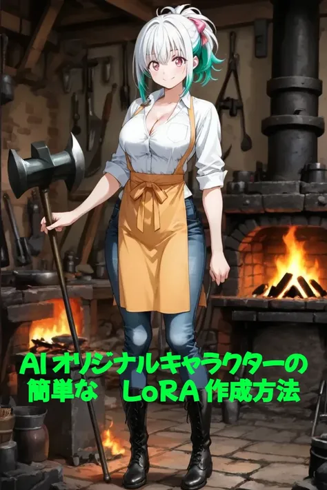 00:59AIオリジナルキャラクターの簡単なLoRA作成方法(日本語版)今回はOC(オリジナルキャラクター)の簡単なLoRAトレーニングを動画で紹介させていただきます。詳細手順は動画を参照していただきたいのですが、概要としてはAIアプリの【二次元キャラクターの一貫性】や【アニメキャラクターの一貫性】を使用してキャラクターを固定するという方法です。画像生成時のコストが気になるところですが、実はこのAIアプリはキャラクターの再現性が非常に高いため、通常の画像生成で頑張って何度もLoRAトレーニングを重ねるよりも、確実にキャラクターを固定しやすくなります。実は下のキャラクターLoRAもこの方法でトレーニングを行い、一回のトレーニングでかなり高精度なキャラクターとして固定することができました。一分間のチュートリアルチャレンジということで詳細設定は割愛させていただいておりますので、LoRAトレーニング等の詳細設定について、まだ経験が浅く理解が難しい方は他の記事も参照してください。私の記事を始めて見た方は、ぜひ個人ページから他の記事も参考にしていただければ幸いです。みなさまも素敵なオリジナルキャラクターと末永く寄り添っていけますように・・・♪

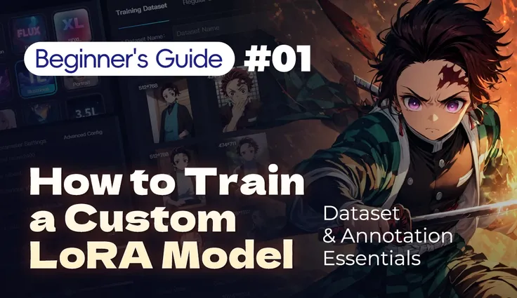 How to Train a Custom LoRA Model | Beginner's Guide 01
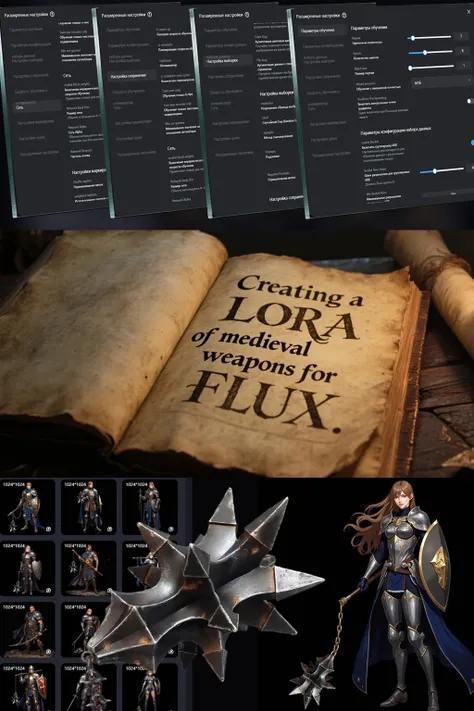 Creating a LoRA of medieval weapons for FLUX
 How To Create Dataset For Training
AI Character

Workflow
Trending creations
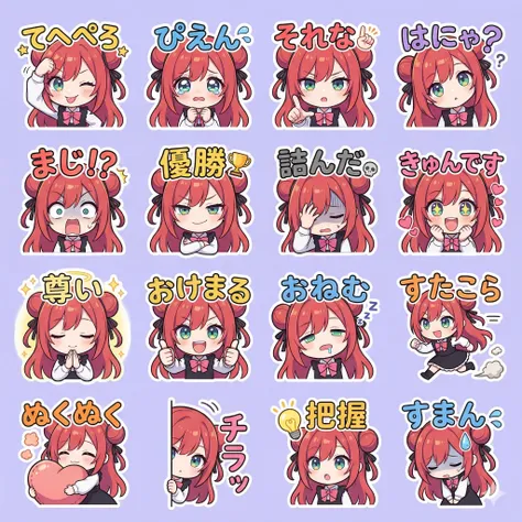 スタンプパターン てへぺろTarget_model: "Nano Banana 2"task: "Sticker Style Sheet Generation - Japanese Slang & Reaction Edition"aspect_ratio: "1:1 Square"style: "Chibi character digital illustration, clean vector lines, vibrant colors. Each sticker has a thick white outline. Highly expressive facial expressions and exaggerated poses."grid_structure:layout: "4x4 grid (16 distinct stickers on a single sheet)"background: "Clean, solid soft pastel lavender background"stickers_content:row_1:sticker_1: "Chibi sticking out tongue and lightly hitting head with a fist, playful wink. Text: 'てへぺろ'"sticker_2: "Chibi with large, watery, 'puppy dog' eyes, looking sad/emotional. Text: 'ぴえん'"sticker_3: "Chibi pointing emphatically with a serious but agreeing face. Text: 'それな'"sticker_4: "Chibi tilting head with a question mark, cute confusion. Text: 'はにゃ?'"row_2:sticker_5: "Chibi with wide eyes and mouth agape, frozen in shock. Text: 'まじ!?'"sticker_6: "Chibi with a smug, knowing smile and folded arms. Text: '優勝'"sticker_7: "Chibi face-palming or looking exhausted with 'exhaustion' lines. Text: '詰んだ'"sticker_8: "Chibi with sparkling eyes looking at something adorable. Text: 'きゅんです'"row_3:sticker_9: "Chibi with hands together in prayer, eyes closed, divine aura. Text: '尊い'"sticker_10: "Chibi doing a 'thumbs up' with both hands, very energetic. Text: 'おけまる'"sticker_11: "Chibi with a half-asleep face and drool bubble. Text: 'おねむ'"sticker_12: "Chibi running fast with dust clouds behind. Text: 'すたこら'"row_4:sticker_13: "Chibi hugging a pillow or heart, very cozy. Text: 'ぬくぬく'"sticker_14: "Chibi peeking from the edge of the sticker frame. Text: 'チラッ'"sticker_15: "Chibi with a bright lightbulb over head, realization. Text: '把握'"sticker_16: "Chibi bowing deeply with a sweat drop. Text: 'すまん'"text_rendering:font: "Playful, bold, hand-drawn Japanese bubble typography. Some words include small emojis like hearts or stars."placement: "Text is positioned to complement the character's pose, ensuring high legibility."accuracy: "Render exact Japanese Hiragana and Katakana characters as specified."output_quality:details: "Focus on exaggerated eye expressions (sparkles, tears, hearts). Clean professional sticker sheet layout ready for cropping."
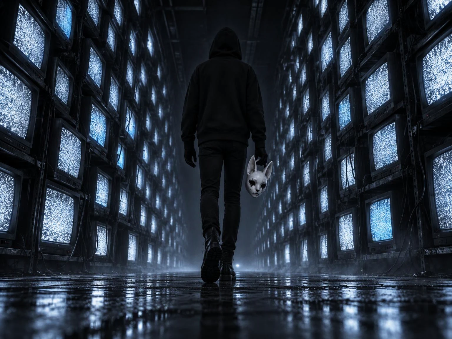
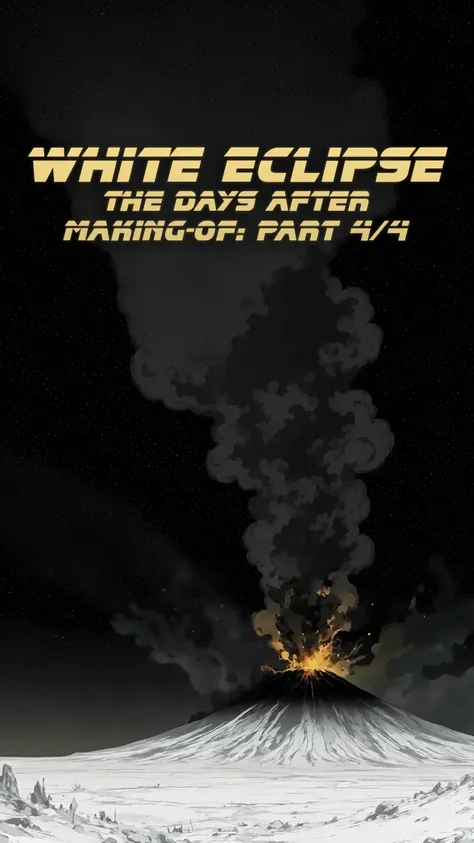 WHITE ECLIPSE - MAKING OF 4/4Hi everyone !In this series of posts, I will share a bit more about the creation process of White Eclipse, to give tips for aspiring directors to take a shot at these kinds of projects. This is the final post of the series you can find the other ones here: WHITE ECLIPSE MAKING OF 1/4, WHITE ECLIPSE MAKING OF 2/4 and WHITE ECLIPSE MAKING OF 3/4.Let's go !BEHIND THE SCENES #4: The Post-Mortem (Lessons Learned) Every project is a lesson. Now that the dust of White Eclipse has settled, here is my honest post-mortem on creating long-form AI content:1. The Consistency Struggle: Despite my strict character macros, keeping 100% consistency across 70+ shots was impossible. For budget and time reasons, I had to make compromises. It’s a minor regret, but a necessary one to cross the finish line. Olympe has suffered the most from this as you can see in the gallery (including some cut content).2. The Technical Hell: Dealing with large files, audio syncing, browser compression, and upload errors was exhausting. Making a 4-minute video requires infinitely more patience than generating a dozen 4K pictures.3. Emotional Investment vs. ROI: Let's be real: the algorithm favors quick, easy-to-consume images over long, slow-burn emotional videos. The views and likes will never match the raw hours put into it. On top of that I realized my post had some visibility issues and could not be seen from some users but it's not very clear to me who's able to see it and who cannot and why. But that’s okay. You don’t make a project like this for the algorithm. You make it for yourself, and for the core fans who actually take the time to immerse themselves in your world. I am just curious so if some of you read this but could not access White Eclipse, please let me know in comment. The link is here: WHITE ECLIPSE.4. The Future: Looking back, the art style of White Eclipse was beautiful, but perhaps a bit "safe" or classical. For the next chapters of the Empire, I plan to take bolder, more experimental artistic risks. More on this in future announcements.5. IP uncertainty: Looking back, I also wish I had the time to build my own version of the score Time in the form of an original cover or a content which balances the same sense of epic sci-fi tragedy. It is a lesson I keep in mind for future projects knowing that the next ones is currently thought around quite famous songs. Quite a challenge to figure out how I will manage that...Before closing this series I wanted to express my gratitude to genious video creators like osti, Franz, toybox, ポニテ至上主義, GURE5-56 and many others which content made us dream during Chaos Reborn. It is thanks to creators like them who push the boundaries of video creation I decided to do something myself. Thank you guys !Thank you to all of you for reading these making-of diaries. The Empire will return."The best is yet to come."みなさん、こんにちは!このシリーズでは、『ホワイト・エクリプス』の制作過程についてもう少し詳しくお伝えし、将来監督を目指す方々がこうしたプロジェクトに挑戦するためのヒントを提供したいと思います。これはシリーズの最終回です。他の記事はこちらからご覧いただけます: WHITE ECLIPSE MAKING OF 1/4, WHITE ECLIPSE MAKING OF 2/4 & WHITE ECLIPSE MAKING OF 3/4.。さあ、始めましょう!メイキング #4:ポストモーテム(学んだ教訓) リンクは英語版にありますどのプロジェクトも学びの場です。『White Eclipse』の騒ぎも一段落した今、長編AIコンテンツ制作に関する私の率直な振り返りを共有します:1. 一貫性の苦闘:厳格なキャラクターマクロを設定したにもかかわらず、70カット以上で100%の一貫性を保つことは不可能でした。予算と時間の都合上、妥協せざるを得ませんでした。些細な後悔ではあるが、ゴールにたどり着くためには必要な妥協だった。ギャラリー(カットされたコンテンツも含む)を見ればわかる通り、この影響を最も受けたのはオリンプだ。2. 技術的な地獄:大容量ファイルの扱い、音声の同期、ブラウザでの圧縮、アップロードエラーへの対応は、本当に骨が折れた。4分間の動画を作るには、4K画像を十数枚生成するよりも、はるかに多くの忍耐が必要だ。3. 感情的な没入感 vs. ROI:現実を見ましょう。アルゴリズムは、長くじっくりと感情に訴えかける動画よりも、手っ取り早く消費できる画像を優先します。視聴回数や「いいね」の数は、制作に費やした膨大な時間に見合うことは決してありません。さらに、私の投稿には表示上の問題があり、一部のユーザーには表示されないことがわかりました。ただ、誰が閲覧できて誰が閲覧できないのか、その理由が私にははっきりとはわかりません。でも、それでいいのです。こういうプロジェクトは、アルゴリズムのために作るものではありません。自分自身のために、そして実際に時間をかけて自分の世界に没頭してくれるコアなファンのために作るのです。ただ気になったので、これを読んでいるのに『White Eclipse』にアクセスできなかった方がいたら、コメントで教えてください。リンクはこちら:WHITE ECLIPSE。4. 未来について: 振り返ってみると、『White Eclipse』のアートスタイルは美しいものでしたが、おそらく少し「無難」あるいは古典的すぎたかもしれません。『Empire』の次の章では、より大胆で実験的な芸術的挑戦を試みる予定です。これについては今後の発表で詳しくお伝えします。5. 知的財産権に関する不確実性:振り返ってみると、オリジナルカバーや、あの壮大なSF悲劇の雰囲気を再現したコンテンツという形で、『Time』の私なりのアレンジを作れる時間があればよかったとも思います。次のプロジェクトは現在、かなり有名な楽曲を軸に構想されているため、これは今後のプロジェクトに向けて心に留めておくべき教訓です。どううまくやりくりするか、なかなかの難題になりそうです……このシリーズを締めくくる前に、osti、Franz、toybox、ポニテ至上主義、GURE5-56をはじめとする、Chaos Reborn期間中、そのコンテンツで私たちに夢を見せてくれた天才的な動画クリエイターの皆さんに感謝の意を表したいと思います。動画制作の限界を押し広げてくれるこうしたクリエイターたちのおかげで、私も何かやってみようと決心しました。皆さん、本当にありがとう!このメイキング日記を読んでくださった皆様、本当にありがとうございました。帝国は帰ってくる。「The best is yet to come.」
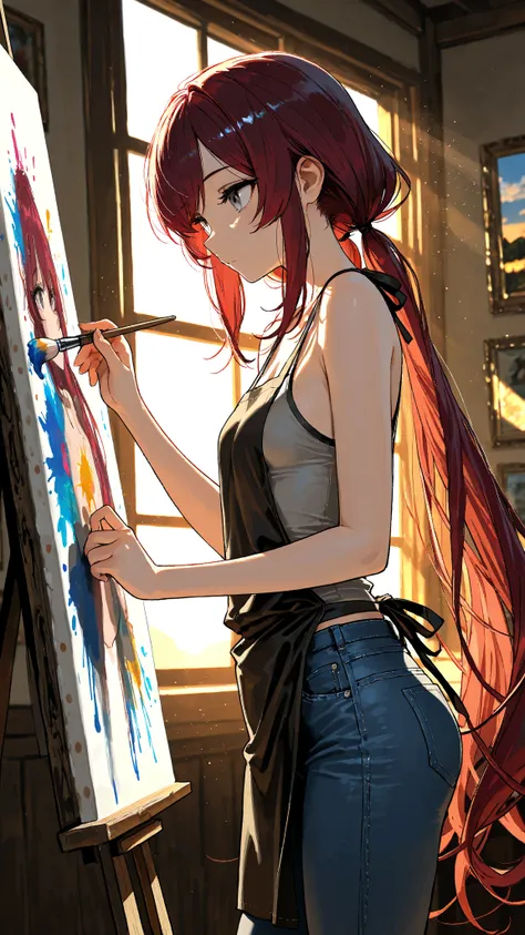 How to create your own OC Design/Reference SheetThe majority of images seen in the gallery were created with REED_Illustration_IL_SDXL.Hello, I will show the creative process I use when creating a new OC and implementing or tweaking changes throughout the creative process.Firstly, let's start by setting up the image template before we adjust our new character. To create a proper OC sheet, include these: (character sheet), (color guide), (multiple views), Each serves a core focus to giving to providing multiple views, angles and the core colors of your character. A simple background is recommended, but feel free to add some minor doodads that might be associated with your character. You could also add, "Different emotions: sad, mad, happy, etc." Close up, upper body, portrait, could be used to strictly illustrate a character's facial features. A character's default expression is highly important to illustrating their character. For example, let's view my OC Kaylen. Right away, her personality is established as someone who is stoic and somewhat serious. Expressions are important. I'd recommend deciding on what kind of outward personality and expression your OC will have before making the design final.Now that our character sheet is set and ready, let's adjust the new character. My vision was a villainous character with a unique weapon who wears a mask. Initially, I went with a white hair color and green eyes.Since the character sheet prompt is ready and available, it is easy to tweak certain characteristics to see which works best with the design and personality. See how the design gradually changed as more ideas were implemented? White hair turned into green hair with white highlights. A scar was added below one eye while the core mask and weapon remained. Sometimes the final product doesn't fully reflect the initial vision. That's part of the creative process I enjoy.If you have spare credits, I'd recommend this useful tool for bringing more detail to your OC. Lastly, as before, check hands and watermarks (notice there are some in the gallery). Hopefully this tutorial can help those still attempting to create their own OCs. As a Co-Host for the OC Community, I will be helping create events to bring more life to our characters. Thank you if you read through this guide. I will answer any questions in due time. Happy 2026!
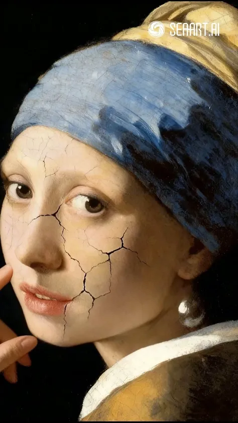 01:36How to seamlessly blend world-famous paintings with your product using AItexture instantly elevated!Text-to-Image Prompt: Cinematic texture. Slightly low-angle shot from the front. The painting is hung in the Royal Art Gallery, with many Europeans and Americans standing with their backs to the camera, gazing at the artwork.Image Revision Prompt (based on reference image): Obvious cracks appear on the woman's face.