
✅️Header image: Use a landscape image
My research on using header images (background images) in SeaArtFilm
In conclusion, it's best to use landscape images.
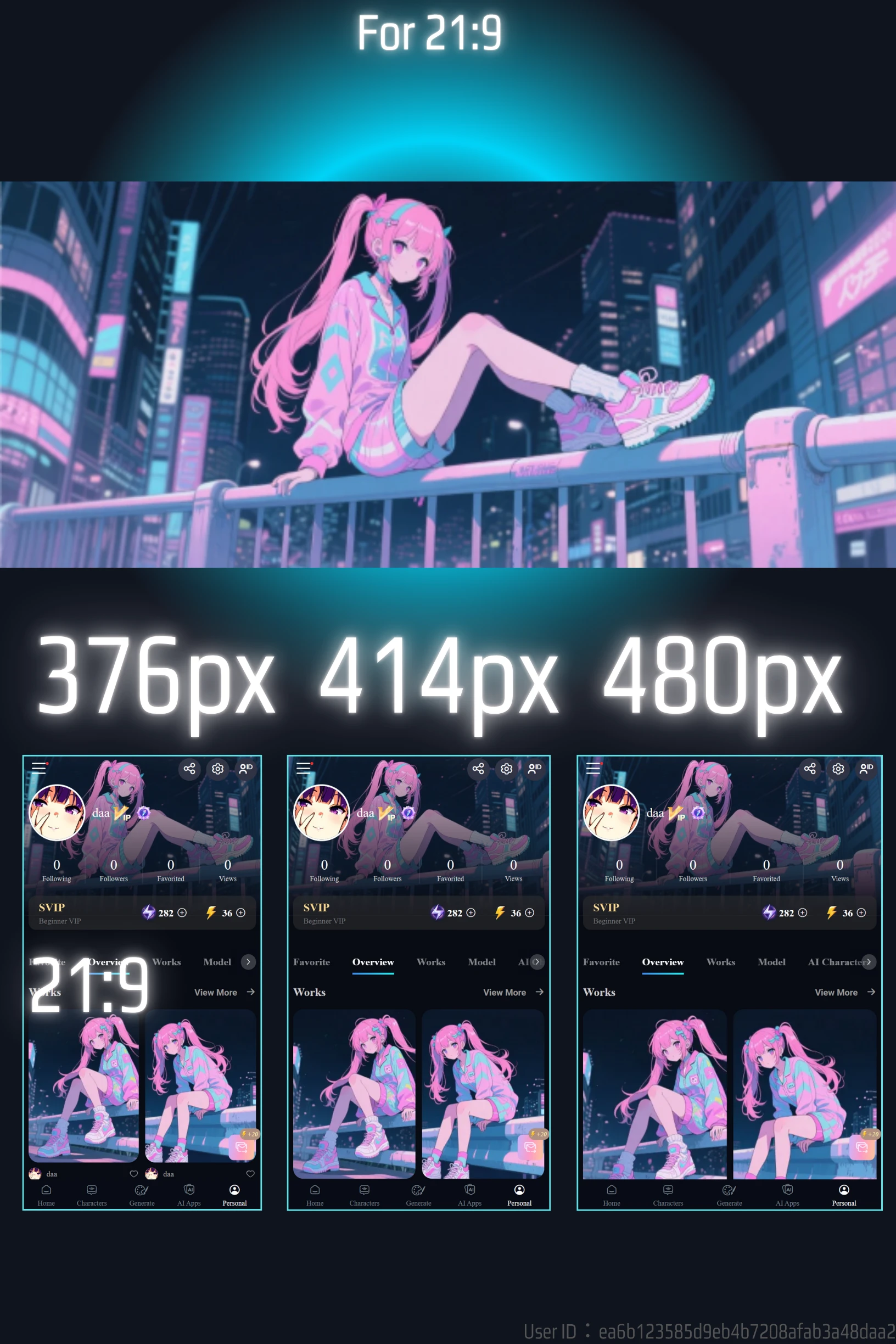
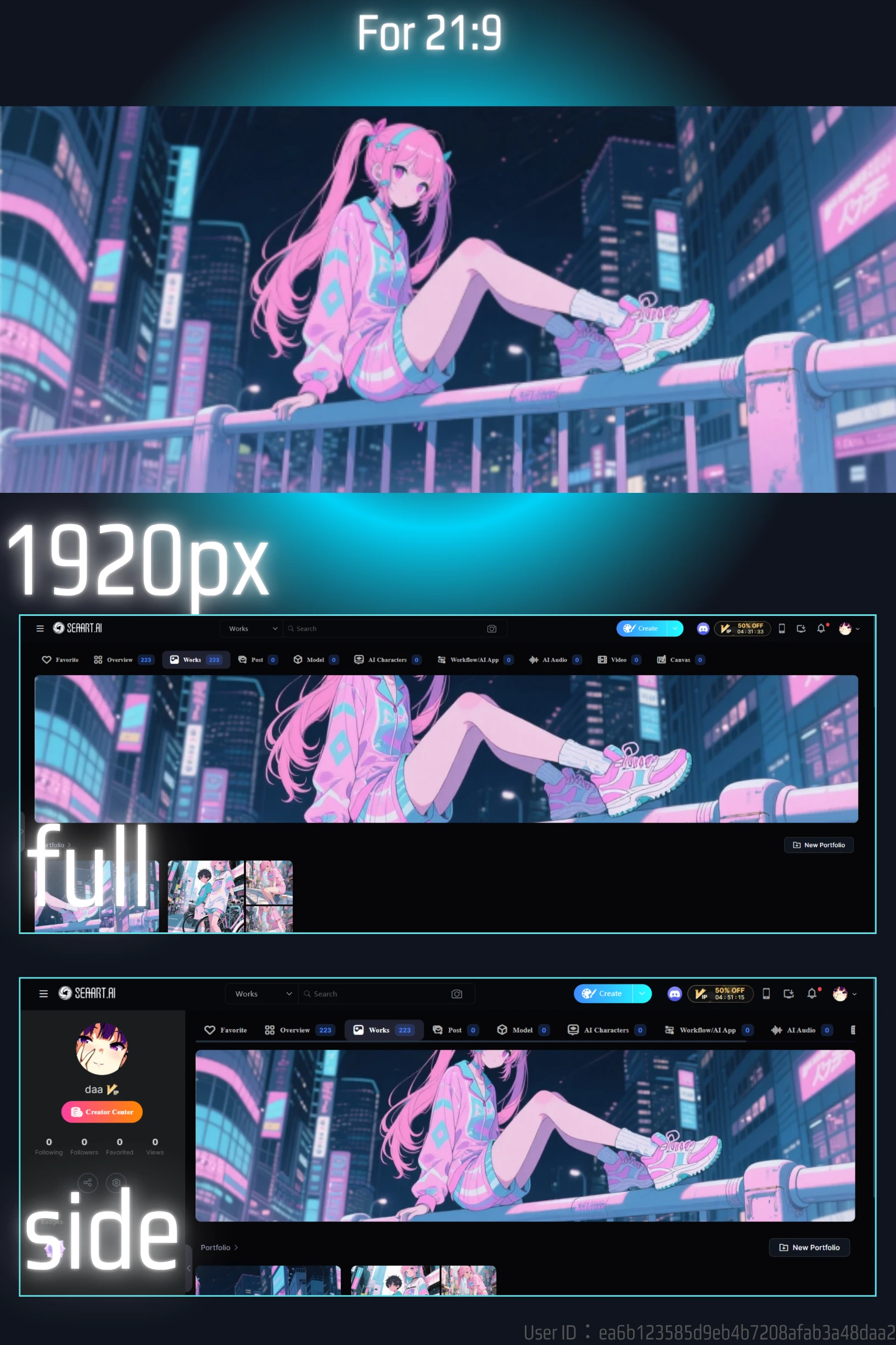
- 21:9
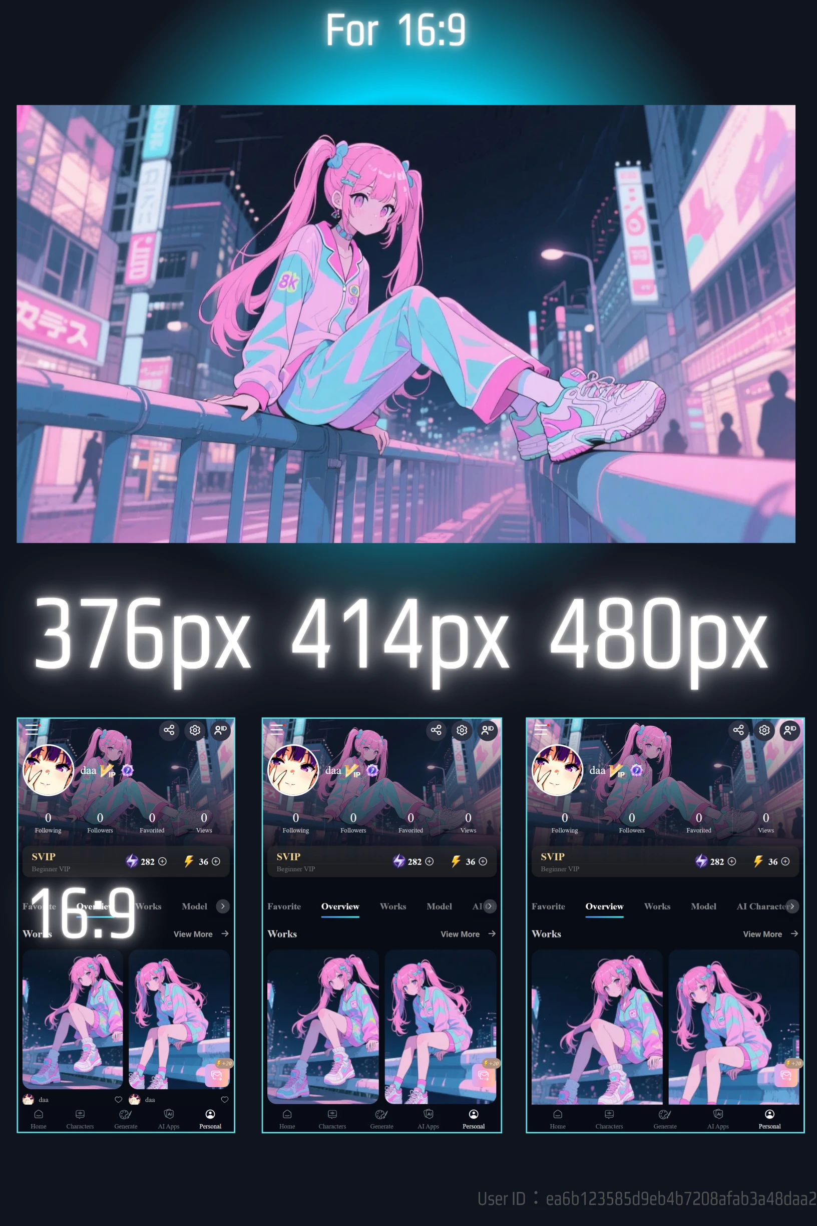
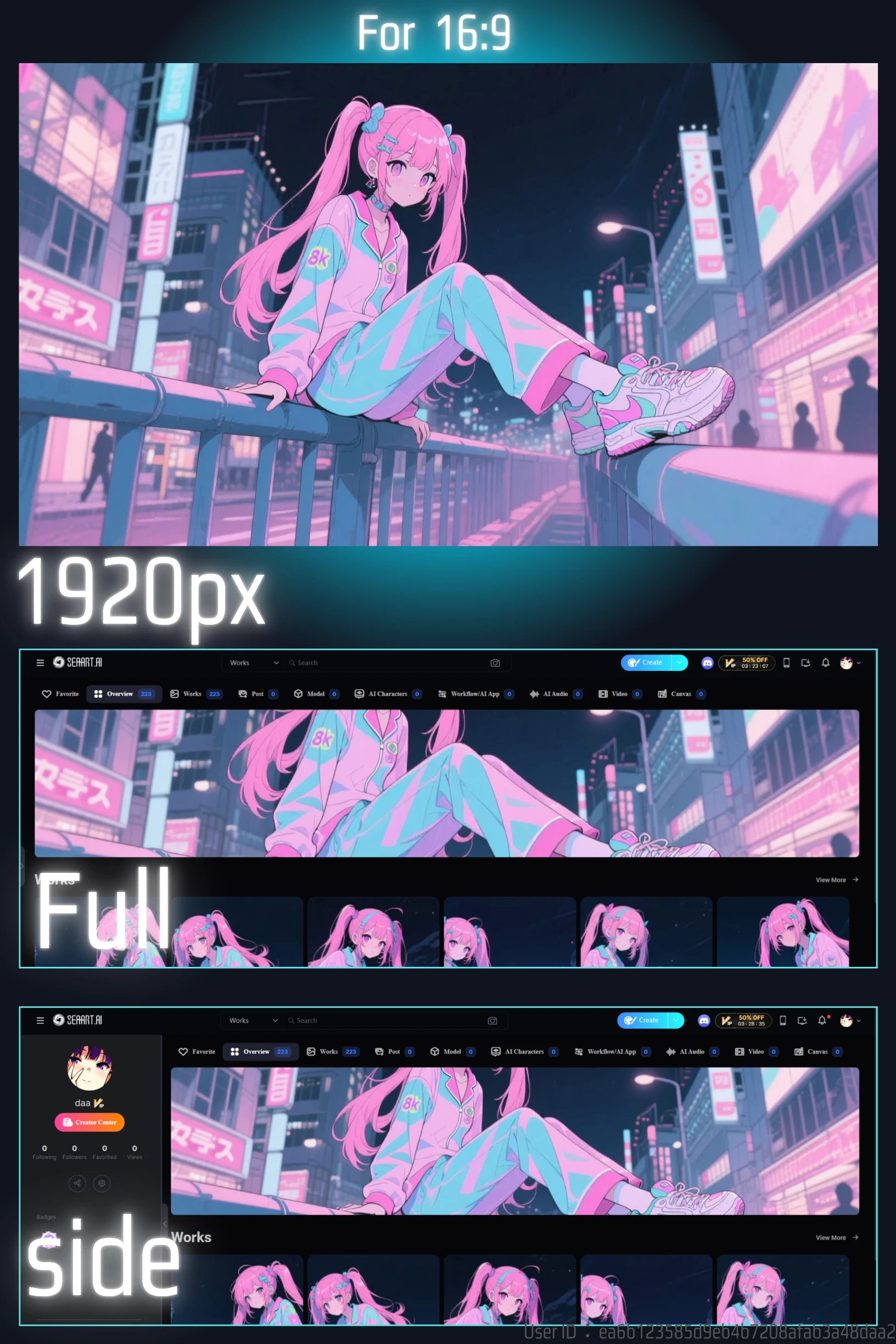
- 16:9
21:9 was especially good.
Note: Here is information summarizing the generation costs for free users to create these.
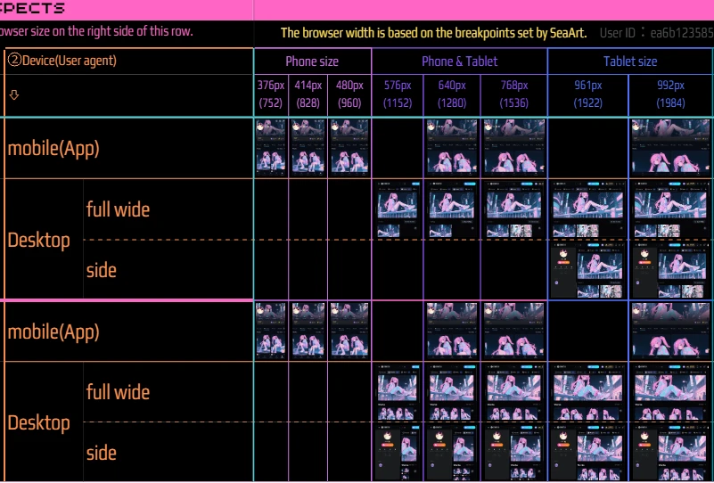
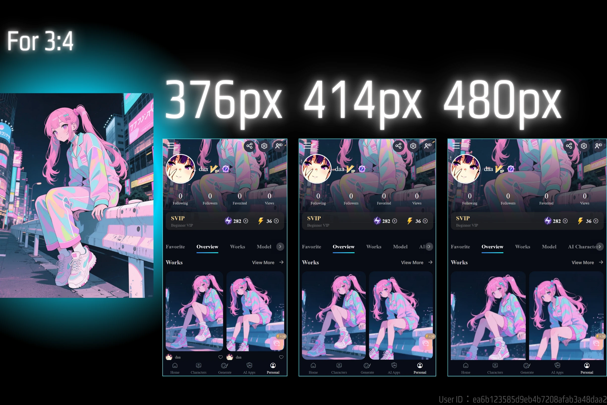
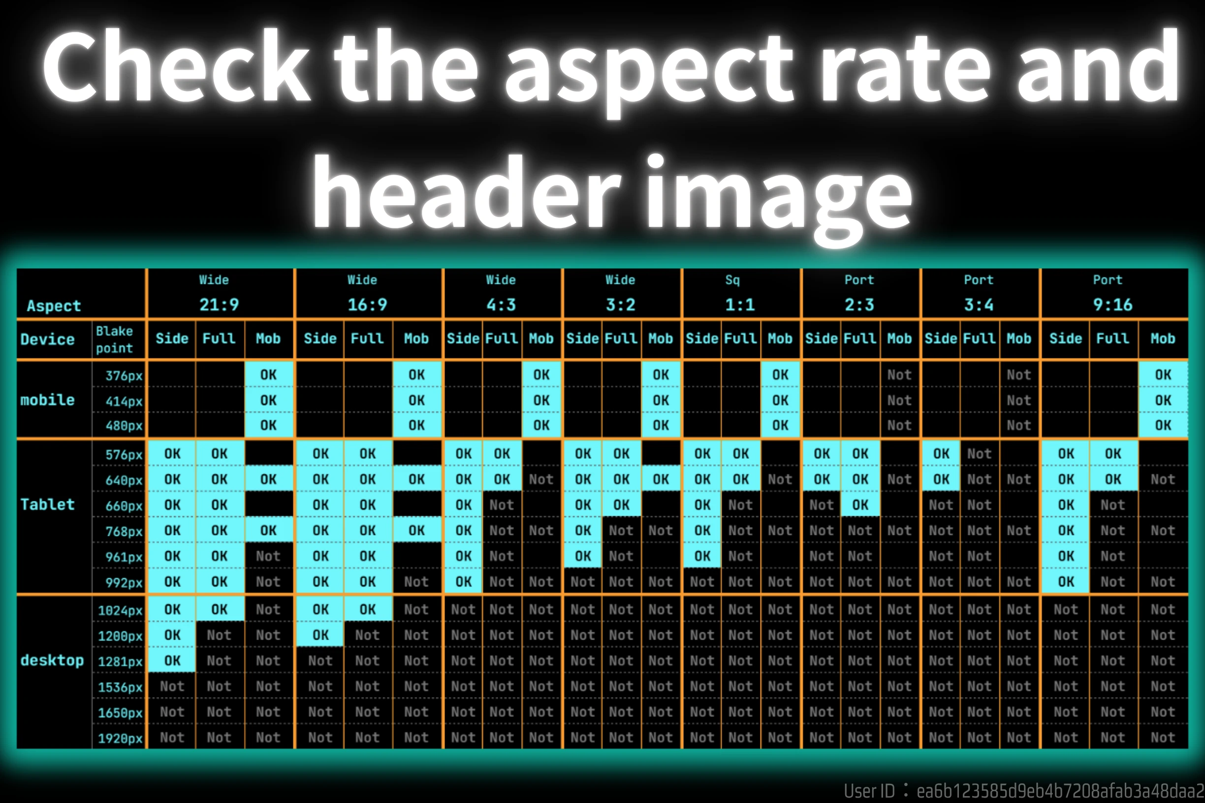
✅️Comparison Table of Image Display Across Different Aspect Ratios and Device Breakpoints
The aspect ratio of the SeaArt Film is a little different from other models. It has a horizontal 21:9 aspect ratio. I don't know why they added it, but it works well with header images. However, if the subject is not in the best position, it will be cut off.
The right side of the next image shows the aspect rate of SeaArtFilm.
Comparison table by aspect rate
This table contains too much information and may be difficult to read.
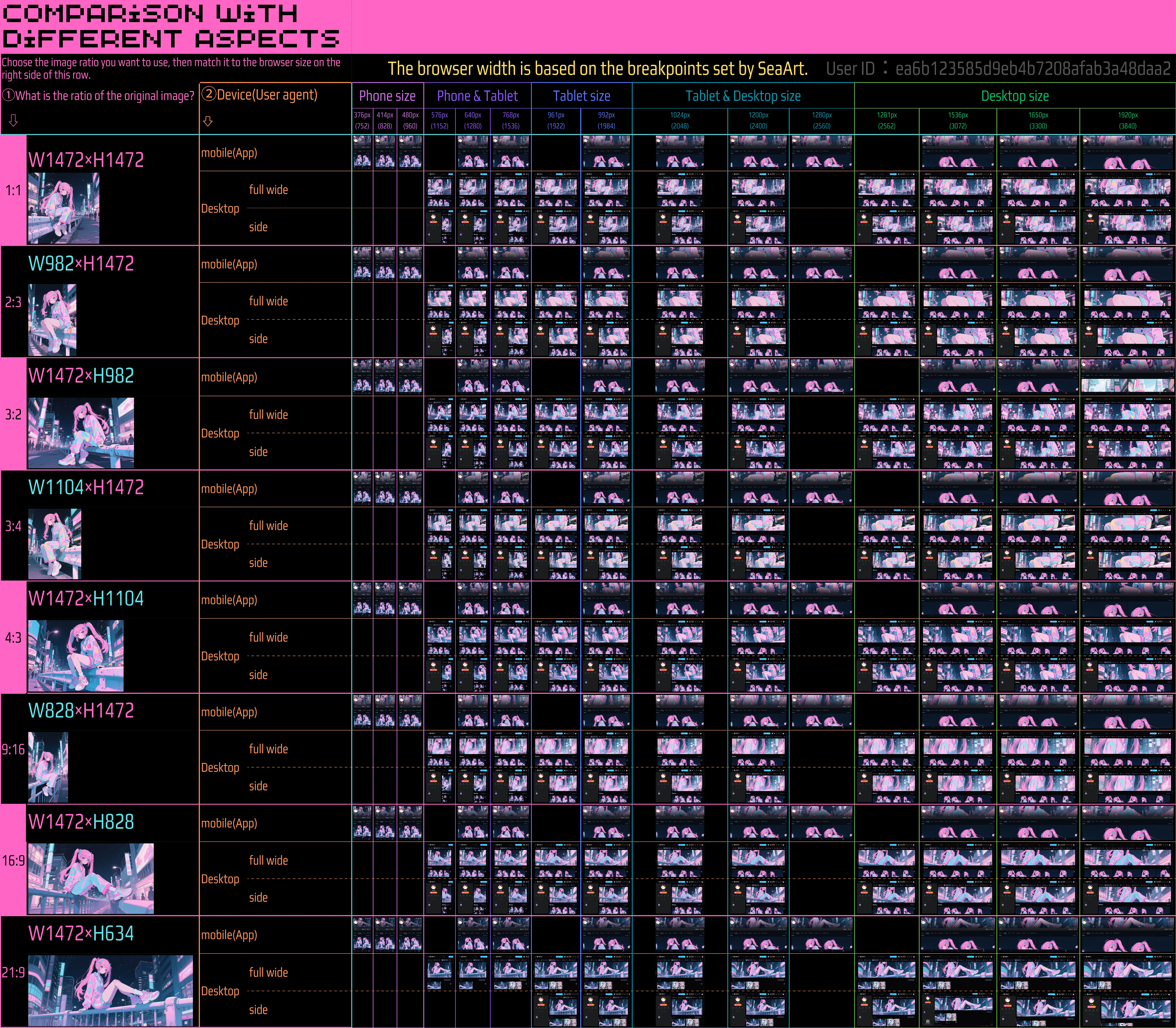
🖼️Full size Image⤴️ …Click on the text for a maximized image
Once you set an image, your header image will change appearance depending on how the page is viewed, and you have no control over this - you should consider the appearance and positioning of your subject matter in relation to how it will be displayed.
First, I will explain the case where a 21:9 image is used in the header, along with how to read the table.
✅️If you haven't set a Header Image yet
- It's recommended to use a horizontal (landscape) image.
- If you use a vertical (portrait) image, CSS
coverproperty will focus the image on its center. This means the image is displayed usingcoverand is centered. - For desktop, the presence or absence of the sidebar also affects the display.
- Web display differs between mobile and desktop based on the user agent.
✅️If you have already set a Header Image
- For mobile users: It's good to consider how the header image will appear on desktop.
- For desktop users: It's good to consider how the header image will appear on mobile.
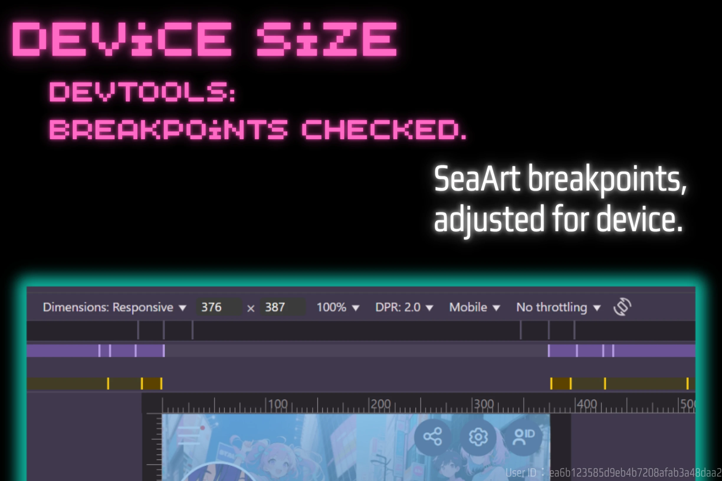
Desktop users, try making the browser smaller as it is.
Desktop users should press F12 to switch to Dev tool. You can set the virtual environment at the top. Set it to the mobile environment and reload. Also, even if you do not use this method, if you make the browser smaller in responsive mode, you can check the display in responsive mode.
More detailed information will follow. For now, please check how your header image is displayed once set.
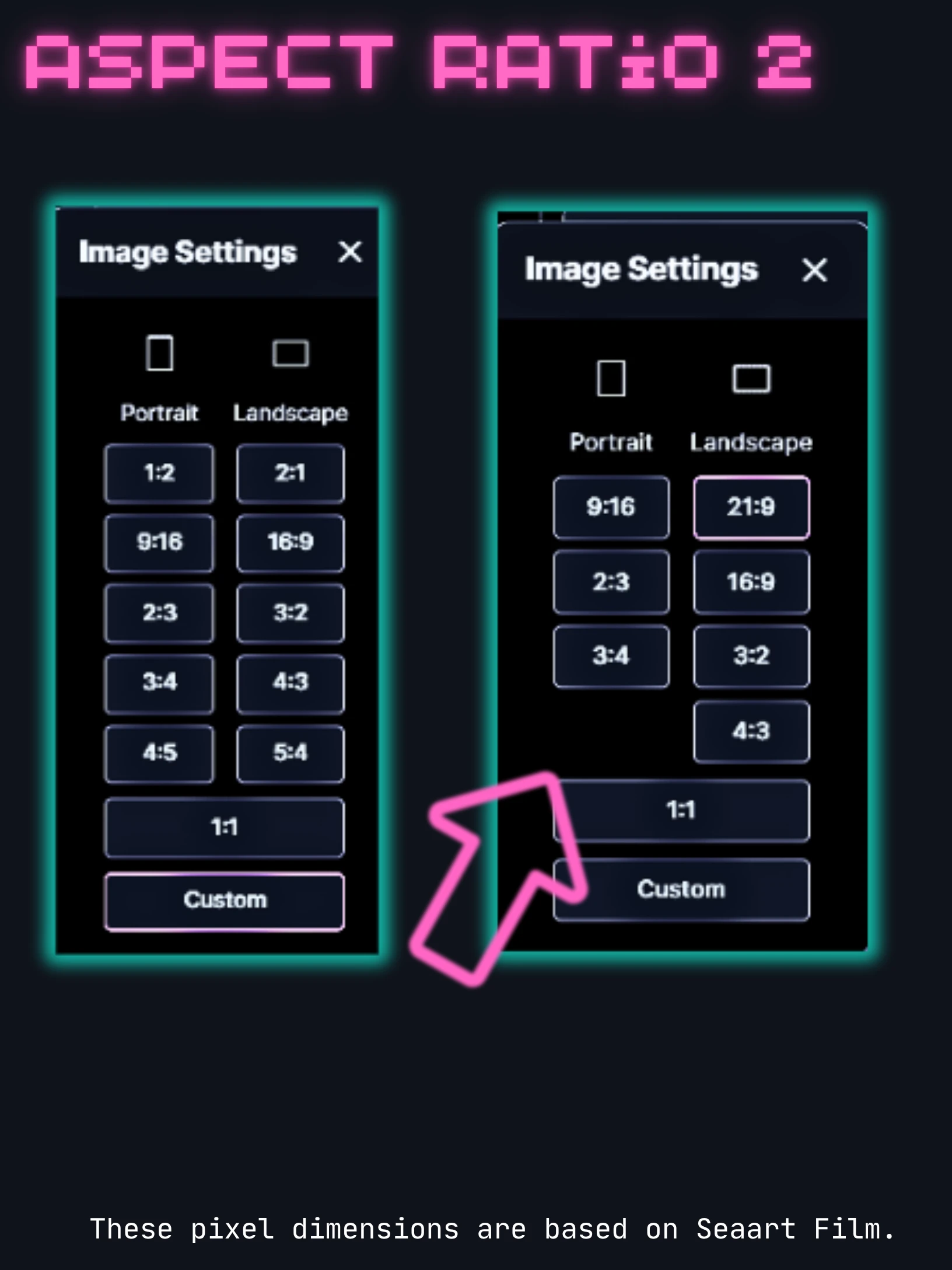
There are 1:1, 2:3, 3:2, 3:4, 4:3, 9:16, 16:9 and 21:9.

On a desktop, portrait mode is responsive so the top and bottom are not visible.

That's why landscape mode is better.
21:9 and 16:9 were relatively good, so I'll explain them first.
Other details about sizes and testing will be explained further below.
Use 21:9 and 16:9 images as header images
🖼️Full size Image⤴️ …Click on the text for a maximized image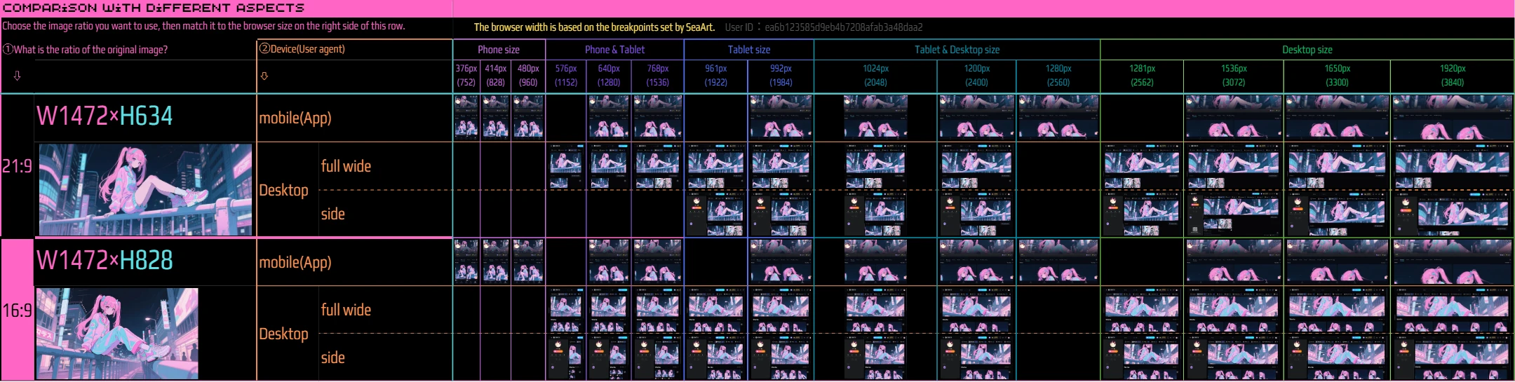 Understanding the Table: Header Image Display
How to Read the Table:
The pixel sizes at the top represent the browser's width. This table categorizes display based on SeaArt's predefined breakpoints.
Detailed numerical measurements will be provided separately.
The classifications for Phone, Tablet, and Desktop have some margin of error but generally indicate the typical range of screen sizes. Actual display may vary depending on the device and environment.
Note:A breakpoint is a specific screen width that triggers a change in how a website or app is displayed.
It's used to optimize the layout, image sizes, and other elements so that the content looks good and functions well across different devices like smartphones, tablets, and PCs.
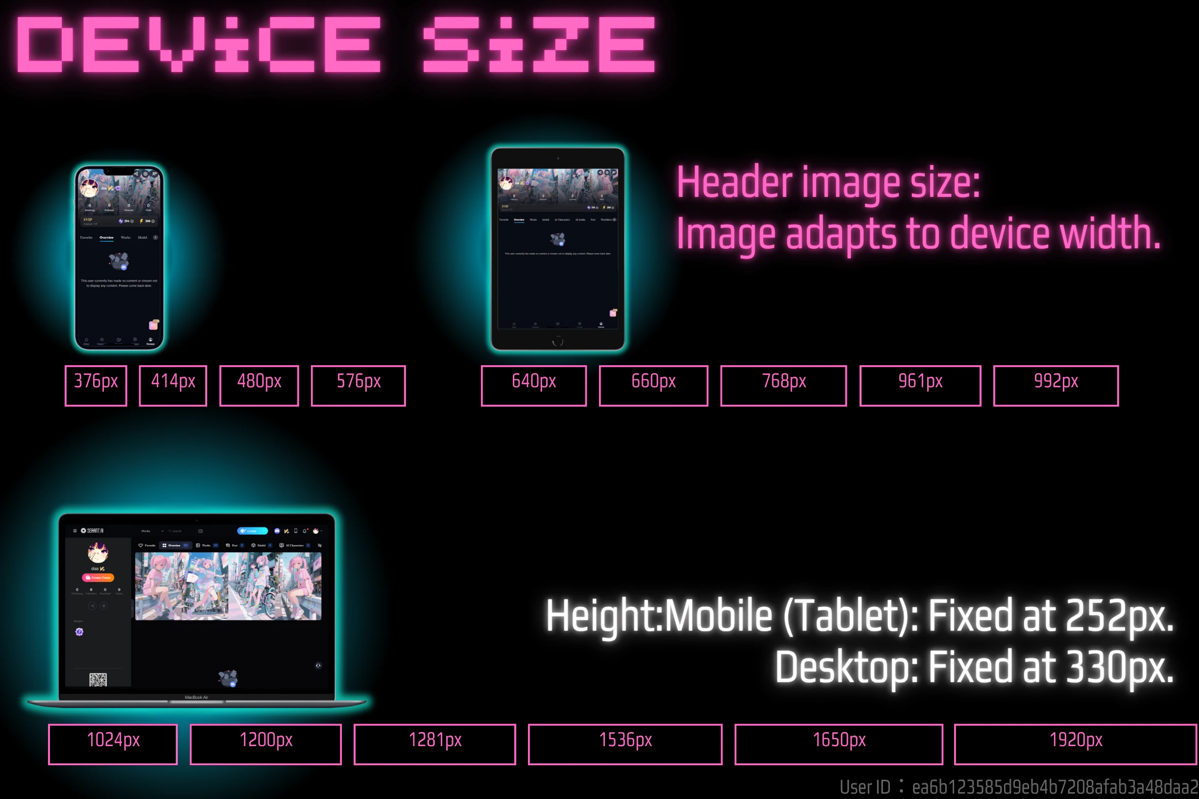
Create a header image with mobile in mind
My research indicates that many SeaArt users primarily use phones, either through the app (Android/iOS) or a web browser.
Note: While web browsers and apps are technically different, their UI is broadly similar.
✅️Desktop: Browser size 1024px
For example, if the browser width is 1024px, we will explain what the width of the header image will be.
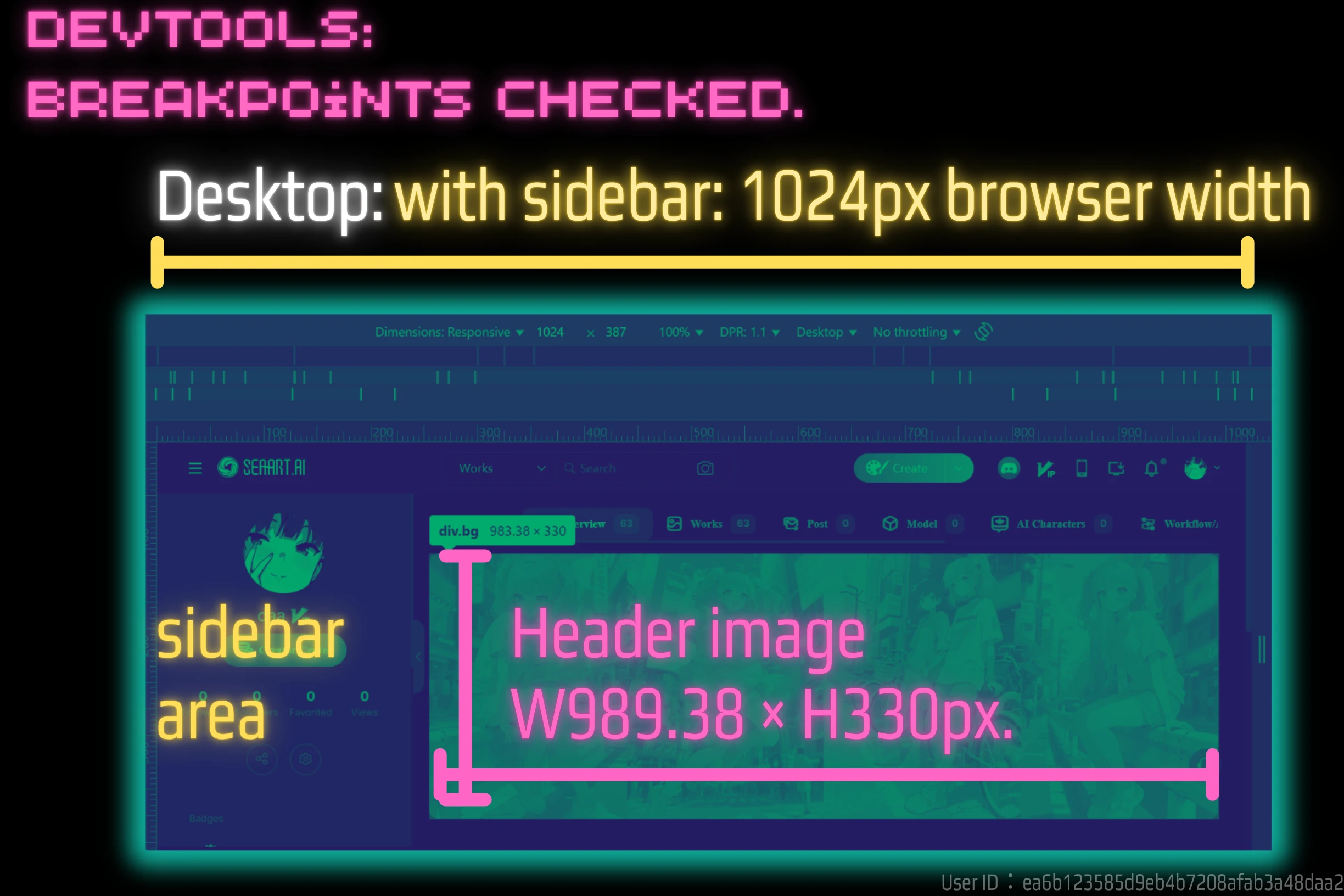
This is the case with a sidebar. The size of the header image is 989.38px wide and 330px high.
The height is 330px for Desktop and fixed at 252px for mobile
This height is always constant. Whether the width is 500px or 2000px, the height is 330px.
However, this is for Desktop. If the user agent is mobile, it is fixed at 252px.
Please see the following image for details.
✅️Mobile: Browser size 376px
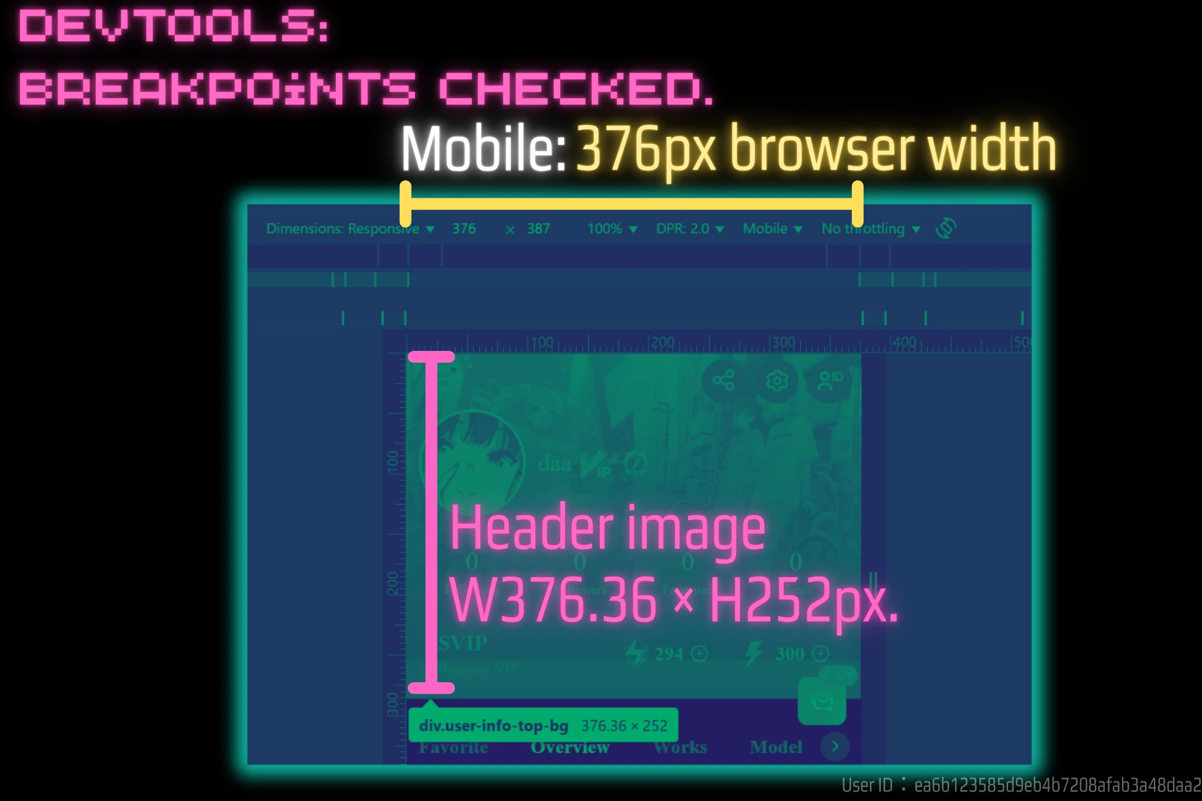
For mobile, there is no margin or padding on the side, so the width will be the width of the image.
It's about 376px. And the height will be 252px. The height value will be fixed.
Quick check Lists
A while back I briefly mentioned the tolerances involved in sizing images. Images are more accurate.
Note: Here is information summarizing the generation costs for free users to create these.


