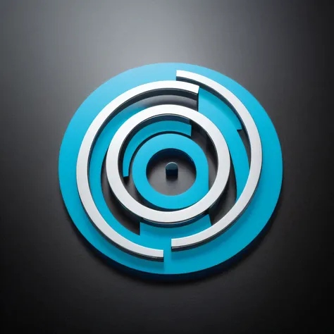
A close up of a blue and white circular object on a black surface


Envision a logo for a leading leasing company that stands out in a sea of competitors, an emblem that resonates with the essence of flexibility, trust, and growth - the very pillars of the leasing industry. Start with the central motif: an abstract representation of a key, but not just any key. This key is fluid in design, its contours bending and looping, symbolizing the adaptability and customizability that leasing offers. The top of the key isn't a traditional shape; instead, it gently morphs into an infinity symbol, subtly emphasizing endless possibilities and boundless opportunities. Around this fluid key, imagine two elliptical orbits. These orbits represent the cyclical nature of leasing – the acquisition, the term, and the return or renewal. They're a nod to the company's full-circle service, guiding clients every step of the way, from the first inquiry to the final handshake. The color palette is a sophisticated blend of deep blues and silvers. The blue stands for trust, reliability, and depth, while the silver accentuates modernity, clarity, and precision. These colors intertwine, much like the services the company provides, showcasing a seamless blend of tradition and innovation. Now, the texture: a subtle gradient. It moves from a solid, deep blue at the base of the key, representing the company's solid foundation and principles, gradually fading into a translucent hue as it reaches the tip, symbolizing clarity, transparency, and openness in dealings. The overall shape of the logo is a gentle oval, reinforcing the idea of cycles, of beginnings and renewals. The oval shape is also universally appealing, giving the emblem a sense of inclusivity, inviting businesses from all sectors to experience the company's unparalleled leasing solutions. In its entirety, this mark is not just an emblem but a promise. A promise of flexibility, of trust, of a partnership that understands and adapts. It's a beacon for businesses searching for a leasing partner who's
提示詞
復製
Envision a logo for a leading leasing company that stands out in a sea of competitors
,
an emblem that resonates with the essence of flexibility
,
trust
,
and growth - the very pillars of the leasing industry
.
Start with the central motif: an abstract representation of a key
,
but not just any key
.
This key is fluid in design
,
its contours bending and looping
,
symbolizing the adaptability and customizability that leasing offers
.
The top of the key isn't a traditional shape
;
instead
,
it gently morphs into an infinity symbol
,
subtly emphasizing endless possibilities and boundless opportunities
.
Around this fluid key
,
imagine two elliptical orbits
.
These orbits represent the cyclical nature of leasing – the acquisition
,
the term
,
and the return or renewal
.
They're a nod to the company's full-circle service
,
guiding clients every step of the way
,
from the first inquiry to the final handshake
.
The color palette is a sophisticated blend of deep blues and silvers
.
The blue stands for trust
,
reliability
,
and depth
,
while the silver accentuates modernity
,
clarity
,
and precision
.
These colors intertwine
,
much like the services the company provides
,
showcasing a seamless blend of tradition and innovation
.
Now
,
the texture: a subtle gradient
.
It moves from a solid
,
deep blue at the base of the key
,
representing the company's solid foundation and principles
,
gradually fading into a translucent hue as it reaches the tip
,
symbolizing clarity
,
transparency
,
and openness in dealings
.
The overall shape of the logo is a gentle oval
,
reinforcing the idea of cycles
,
of beginnings and renewals
.
The oval shape is also universally appealing
,
giving the emblem a sense of inclusivity
,
inviting businesses from all sectors to experience the company's unparalleled leasing solutions
.
In its entirety
,
this mark is not just an emblem but a promise
.
A promise of flexibility
,
of trust
,
of a partnership that understands and adapts
.
It's a beacon for businesses searching for a leasing partner who's
信息
模型 & 風格

模型
Beautiful Realistic Asians
共 0 條評論
0
2
0