Evidence is needed to sweep the black,List of counter-terrorism needs
![Evidence is needed to sweep the black,List of counter-terrorism needs,Counterinsurgency only needs coordinates and evidence to sweep away the black,List of counter-terrorism needs,Only coordinates are needed to counterinsurgency

directory
statement:Baidu Encyclopedia is a free editing platform,There is no charge for the compilation service
detail
Learn about color grading in less than a minute
43.80,000 42"
Color [tiáo sè]
Fine art concept
Grading refers to changing a specific hue,Form another tonal picture with a different feeling。 Color grading is the easiest to confuse everyone,Techniques that I find difficult to master in practice。Let many enthusiasts ask for tutorials everywhere,It took a lot of effort and time to experiment with color grading。
Make black and white photos(or transparent positive)A black and white image is converted to another single-pack image。It is usually done in two steps,The first step is to bleach the silver shades on the photo that has been soaked in clean water,The second step is to discolor the silver shadow with toner。[3]
Chinese name
color
Foreign name
hue
Pinyin
tiáo sè
paraphrase
Change the hue to form a picture with different sensory tones
apply
fine arts、Professional beautification software
Related videos
more
1.10,000 plays | 15:00
【Da Vinci color grading】Boy!A few steps to adjust the little sister to look good
1.20,000 plays | 12:06
Gray grading solves your color grading problem
1 Play | 01:13
Portrait post color grading PS tutorial,Change the color of the photo's lips!
5374 Replay | 08:46
PR skills, color grading,Use Lumutre to load a color grading preset file,Quick color grading is not the same thing
6889 Replay | 01:22
No wonder the colors you tune out are "Dirty",Do you know these grading scales??
5277 Replay | 03:17
postscript: Different color grading techniques,PS Color grading tutorial
6614 Replay | 09:26
Are you still blind to color grading?Come and learn the basics of color grading theory,Become the next master of art
5151 Replay | 08:10
Color grading tutorial,How to bring up healing photos
6515 Replay | 00:12
Film and television post-production - secondary color grading
5253 Playback | 00:14
「Color grading tutorial」Master these key video color grading techniques,Make your own blockbuster!
fast
navigation
Basic principle
Color function
Learning methods
Color mode
Color determination
Internet
Basic classification
Color standard
Hue ring
Type of pigment
Toning techniques
How to use
Color grading software
Software color grading
match colors
Theoretical basis
match colors
The problem of color matching is really not a simple one。This generation of designers is better than the previous generation,There are more color tools available。now,We can use the rich colors that the computer offers us,It seems that this is not a very simple thing。Personally,Since I started working as a designer,They are often lost in the world of people of color。Elements to pay attention to when actually designing color matching,We often think about form in terms of the purpose of design、Texture-related color matching and color zone processing schemes,This scheme is my color scheme。When making a color matching plan,We should consider the following points to highlight the visuals。
Background color and graphic color at design time, We often come across compositions of various shapes in several colors,The color as the base, We tend to push it further,and as the color of graphics or text, We need to bring it closer。This requires us to understand what the impact of color matching is。Typically,Bright, vivid colors are more likely to produce graphic effects than dark colors。Therefore,When matching colors, In order to achieve a clear graphic effect, You must first consider the relationship between the graphic color and the base color。The graphic color should have some contrast with the base color。In this way, We can clearly communicate what we want to say。The color of the graphic that we want to highlight must be able to attract the main attention of the viewer。If not, It will be overwhelming。
Overall tone
If we want our designs to come to life,Robust,Hot or cold,Sensations such as cold are determined by the overall tone。So how do we control the overall tone?Only the hues that make up the overall tone can be well controlled、Lightness、Purity relationship and area relationship, etc。Only that's it,We can control the overall color tone of the design。Above all, The color that occupies a large area should be decided in the center of the color matching,And choosing different color schemes based on this color will give you different overall tones。Choose what we want。If we use a warm color series to do our overall tone, It will take on a warm feeling,vice versa。If warm and high purity colors are used as the overall tone, It gives a fiery and stimulating feeling,Cool and low-purity colors are the main colors, It makes people feel cold、calm feeling。High-brightness colors are bright,It becomes brisk,Colors with low brightness are more solemn、Solemn。Take contrasting tones and brightness and liveliness,Take something similar、The same color system feels stable。A large number of shades will be gorgeous,Less is elegance、freshen。The choice of the overall tone of the above points,It's determined by what we want to express。
A balance of colours
The balance of color is the strength of color、weight、Deepen the balance of this relationship。These elements feel and affect the balance of colors。Therefore,Even with the same color scheme,It will also be decided to become a harmonious or discordant color depending on the shape and area of the figure。generally, Similar color schemes are easier to balance。A solid color scheme that is complementary and has similar brightness,wie z:Red and teal color scheme,Due to excessive strength,It will be dazzling,Colors become incongruous。Sin embargo, If the area of the color is reduced or white and black are added,Change its brightness and chromaticity and strike a balance,It can make this harmonious color change。When highly pure and intense colors are combined with cloudy or gray of the same brightness,If the former is smaller in area,The large size of the latter can also be easily balanced。When light and dark colors are configured up and down,If light color is on top](https://image.cdn2.seaart.me/2024-01-22/cmn84jte878c738rl4tg/c846ce138c62729bae4daac4a6f9c7ca4c043be0_high.webp)


Evidence is needed to sweep the black,List of counter-terrorism needs,Counterinsurgency only needs coordinates and evidence to sweep away the black,List of counter-terrorism needs,Only coordinates are needed to counterinsurgency  directory statement:Baidu Encyclopedia is a free editing platform,There is no charge for the compilation service detail Learn about color grading in less than a minute 43.80,000 42" Color [tiáo sè] Fine art concept Grading refers to changing a specific hue,Form another tonal picture with a different feeling。 Color grading is the easiest to confuse everyone,Techniques that I find difficult to master in practice。Let many enthusiasts ask for tutorials everywhere,It took a lot of effort and time to experiment with color grading。 Make black and white photos(or transparent positive)A black and white image is converted to another single-pack image。It is usually done in two steps,The first step is to bleach the silver shades on the photo that has been soaked in clean water,The second step is to discolor the silver shadow with toner。[3] Chinese name color Foreign name hue Pinyin tiáo sè paraphrase Change the hue to form a picture with different sensory tones apply fine arts、Professional beautification software Related videos more 1.10,000 plays | 15:00 【Da Vinci color grading】Boy!A few steps to adjust the little sister to look good 1.20,000 plays | 12:06 Gray grading solves your color grading problem 1 Play | 01:13 Portrait post color grading PS tutorial,Change the color of the photo's lips! 5374 Replay | 08:46 PR skills, color grading,Use Lumutre to load a color grading preset file,Quick color grading is not the same thing 6889 Replay | 01:22 No wonder the colors you tune out are "Dirty",Do you know these grading scales?? 5277 Replay | 03:17 postscript: Different color grading techniques,PS Color grading tutorial 6614 Replay | 09:26 Are you still blind to color grading?Come and learn the basics of color grading theory,Become the next master of art 5151 Replay | 08:10 Color grading tutorial,How to bring up healing photos 6515 Replay | 00:12 Film and television post-production - secondary color grading 5253 Playback | 00:14 「Color grading tutorial」Master these key video color grading techniques,Make your own blockbuster! fast navigation Basic principle Color function Learning methods Color mode Color determination Internet Basic classification Color standard Hue ring Type of pigment Toning techniques How to use Color grading software Software color grading match colors Theoretical basis match colors The problem of color matching is really not a simple one。This generation of designers is better than the previous generation,There are more color tools available。now,We can use the rich colors that the computer offers us,It seems that this is not a very simple thing。Personally,Since I started working as a designer,They are often lost in the world of people of color。Elements to pay attention to when actually designing color matching,We often think about form in terms of the purpose of design、Texture-related color matching and color zone processing schemes,This scheme is my color scheme。When making a color matching plan,We should consider the following points to highlight the visuals。 Background color and graphic color at design time, We often come across compositions of various shapes in several colors,The color as the base, We tend to push it further,and as the color of graphics or text, We need to bring it closer。This requires us to understand what the impact of color matching is。Typically,Bright, vivid colors are more likely to produce graphic effects than dark colors。Therefore,When matching colors, In order to achieve a clear graphic effect, You must first consider the relationship between the graphic color and the base color。The graphic color should have some contrast with the base color。In this way, We can clearly communicate what we want to say。The color of the graphic that we want to highlight must be able to attract the main attention of the viewer。If not, It will be overwhelming。 Overall tone If we want our designs to come to life,Robust,Hot or cold,Sensations such as cold are determined by the overall tone。So how do we control the overall tone?Only the hues that make up the overall tone can be well controlled、Lightness、Purity relationship and area relationship, etc。Only that's it,We can control the overall color tone of the design。Above all, The color that occupies a large area should be decided in the center of the color matching,And choosing different color schemes based on this color will give you different overall tones。Choose what we want。If we use a warm color series to do our overall tone, It will take on a warm feeling,vice versa。If warm and high purity colors are used as the overall tone, It gives a fiery and stimulating feeling,Cool and low-purity colors are the main colors, It makes people feel cold、calm feeling。High-brightness colors are bright,It becomes brisk,Colors with low brightness are more solemn、Solemn。Take contrasting tones and brightness and liveliness,Take something similar、The same color system feels stable。A large number of shades will be gorgeous,Less is elegance、freshen。The choice of the overall tone of the above points,It's determined by what we want to express。 A balance of colours The balance of color is the strength of color、weight、Deepen the balance of this relationship。These elements feel and affect the balance of colors。Therefore,Even with the same color scheme,It will also be decided to become a harmonious or discordant color depending on the shape and area of the figure。generally, Similar color schemes are easier to balance。A solid color scheme that is complementary and has similar brightness,wie z:Red and teal color scheme,Due to excessive strength,It will be dazzling,Colors become incongruous。Sin embargo, If the area of the color is reduced or white and black are added,Change its brightness and chromaticity and strike a balance,It can make this harmonious color change。When highly pure and intense colors are combined with cloudy or gray of the same brightness,If the former is smaller in area,The large size of the latter can also be easily balanced。When light and dark colors are configured up and down,If light color is on top
Prompts
Copiar prompts
Evidence is needed to sweep the black
,
List of counter-terrorism needs
,
Counterinsurgency only needs coordinates and evidence to sweep away the black
,
List of counter-terrorism needs
,
Only coordinates are needed to counterinsurgency

directory
statement:Baidu Encyclopedia is a free editing platform
,
There is no charge for the compilation service
detail
Learn about color grading in less than a minute
43
.
80
,
000 42"
Color [tiáo sè]
Fine art concept
Grading refers to changing a specific hue
,
Form another tonal picture with a different feeling
。
Color grading is the easiest to confuse everyone
,
Techniques that I find difficult to master in practice
。
Let many enthusiasts ask for tutorials everywhere
,
It took a lot of effort and time to experiment with color grading
。
Make black and white photos(or transparent positive)A black and white image is converted to another single-pack image
。
It is usually done in two steps
,
The first step is to bleach the silver shades on the photo that has been soaked in clean water
,
The second step is to discolor the silver shadow with toner
。
[3]
Chinese name
color
Foreign name
hue
Pinyin
tiáo sè
paraphrase
Change the hue to form a picture with different sensory tones
apply
fine arts、Professional beautification software
Related videos
more
1
.
10
,
000 plays | 15:00
【Da Vinci color grading】Boy
!
A few steps to adjust the little sister to look good
1
.
20
,
000 plays | 12:06
Gray grading solves your color grading problem
1 Play | 01:13
Portrait post color grading PS tutorial
,
Change the color of the photo's lips
!
5374 Replay | 08:46
PR skills
,
color grading
,
Use Lumutre to load a color grading preset file
,
Quick color grading is not the same thing
6889 Replay | 01:22
No wonder the colors you tune out are "Dirty"
,
Do you know these grading scales
??
5277 Replay | 03:17
postscript: Different color grading techniques
,
PS Color grading tutorial
6614 Replay | 09:26
Are you still blind to color grading
?
Come and learn the basics of color grading theory
,
Become the next master of art
5151 Replay | 08:10
Color grading tutorial
,
How to bring up healing photos
6515 Replay | 00:12
Film and television post-production - secondary color grading
5253 Playback | 00:14
「Color grading tutorial」Master these key video color grading techniques
,
Make your own blockbuster
!
fast
navigation
Basic principle
Color function
Learning methods
Color mode
Color determination
Internet
Basic classification
Color standard
Hue ring
Type of pigment
Toning techniques
How to use
Color grading software
Software color grading
match colors
Theoretical basis
match colors
The problem of color matching is really not a simple one
。
This generation of designers is better than the previous generation
,
There are more color tools available
。
now
,
We can use the rich colors that the computer offers us
,
It seems that this is not a very simple thing
。
Personally
,
Since I started working as a designer
,
They are often lost in the world of people of color
。
Elements to pay attention to when actually designing color matching
,
We often think about form in terms of the purpose of design、Texture-related color matching and color zone processing schemes
,
This scheme is my color scheme
。
When making a color matching plan
,
We should consider the following points to highlight the visuals
。
Background color and graphic color at design time
,
We often come across compositions of various shapes in several colors
,
The color as the base
,
We tend to push it further
,
and as the color of graphics or text
,
We need to bring it closer
。
This requires us to understand what the impact of color matching is
。
Typically
,
Bright
,
vivid colors are more likely to produce graphic effects than dark colors
。
Therefore
,
When matching colors
,
In order to achieve a clear graphic effect
,
You must first consider the relationship between the graphic color and the base color
。
The graphic color should have some contrast with the base color
。
In this way
,
We can clearly communicate what we want to say
。
The color of the graphic that we want to highlight must be able to attract the main attention of the viewer
。
If not
,
It will be overwhelming
。
Overall tone
If we want our designs to come to life
,
Robust
,
Hot or cold
,
Sensations such as cold are determined by the overall tone
。
So how do we control the overall tone
?
Only the hues that make up the overall tone can be well controlled、Lightness、Purity relationship and area relationship
,
etc
。
Only that's it
,
We can control the overall color tone of the design
。
Above all
,
The color that occupies a large area should be decided in the center of the color matching
,
And choosing different color schemes based on this color will give you different overall tones
。
Choose what we want
。
If we use a warm color series to do our overall tone
,
It will take on a warm feeling
,
vice versa
。
If warm and high purity colors are used as the overall tone
,
It gives a fiery and stimulating feeling
,
Cool and low-purity colors are the main colors
,
It makes people feel cold、calm feeling
。
High-brightness colors are bright
,
It becomes brisk
,
Colors with low brightness are more solemn、Solemn
。
Take contrasting tones and brightness and liveliness
,
Take something similar、The same color system feels stable
。
A large number of shades will be gorgeous
,
Less is elegance、freshen
。
The choice of the overall tone of the above points
,
It's determined by what we want to express
。
A balance of colours
The balance of color is the strength of color、weight、Deepen the balance of this relationship
。
These elements feel and affect the balance of colors
。
Therefore
,
Even with the same color scheme
,
It will also be decided to become a harmonious or discordant color depending on the shape and area of the figure
。
generally
,
Similar color schemes are easier to balance
。
A solid color scheme that is complementary and has similar brightness
,
wie z:Red and teal color scheme
,
Due to excessive strength
,
It will be dazzling
,
Colors become incongruous
。
Sin embargo
,
If the area of the color is reduced or white and black are added
,
Change its brightness and chromaticity and strike a balance
,
It can make this harmonious color change
。
When highly pure and intense colors are combined with cloudy or gray of the same brightness
,
If the former is smaller in area
,
The large size of the latter can also be easily balanced
。
When light and dark colors are configured up and down
,
If light color is on top
INFO
Checkpoint & LoRA
Checkpoint
Cetus-Mix
#Garota De Anime
comentário(s)
0
1
0
Apps de IA Rápida de SeaArt
Troca de Rosto com IA
Explore diferentes identidades e descubra seu novo eu com um clique.
AI Melhorador de Imagens
Experimente um banquete visual em HD agora!
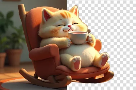
Remover fundo.
IA inteligente para remover o fundo.
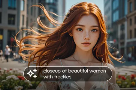
Ferramenta de geração de imagens AI a partir de texto
Transforme textos simples em obras de arte impressionantes.
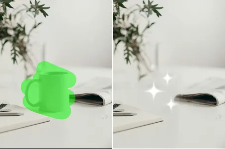
Borrador de IA
Apagar defeitos da imagem ou objetos indesejados mantendo o fundo intacto

Sora Texto-para-Vídeo
Use Linguagem Natural para Gerar Rapidamente Vídeos de 60 Segundos
Explore Nossas Ferramentas de IA Ágeis