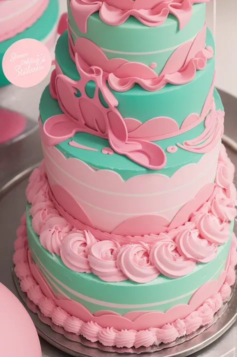
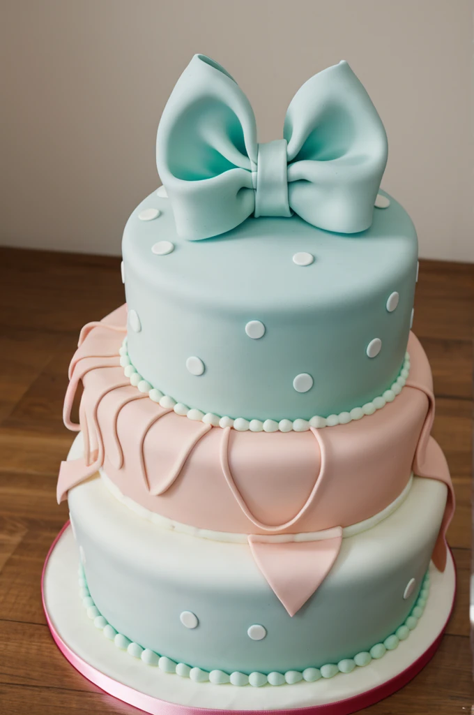
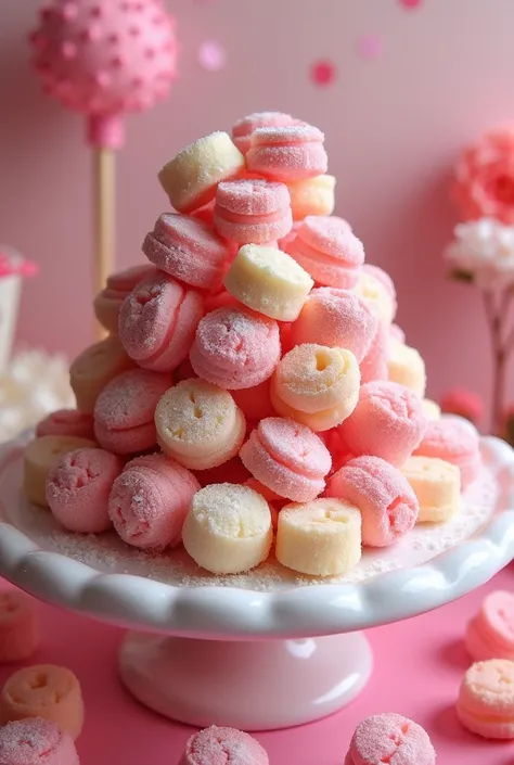
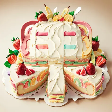
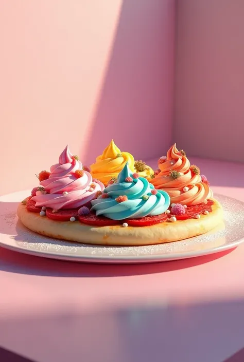
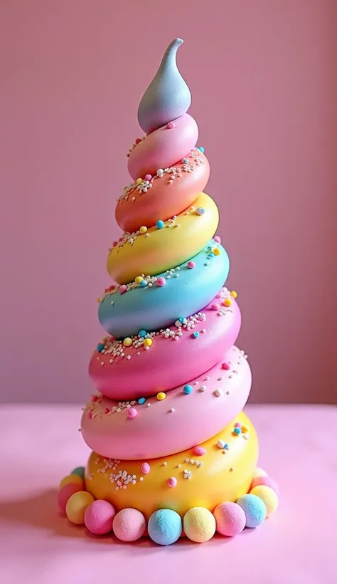
Colors Used: A strong shade of pink as the main color, complemented by a soft mi


Colors Used: A strong shade of pink as the main color, complemented by a soft mint green, a color that evokes freshness and is associated with the food sector. Logo Style: The logo is designed in a unique and distinct way, with a light abstract touch. It incorporates elements that symbolize cakes and sweets in an elegant and sophisticated way.. Main Elements: the name "Bicandy's" is highlighted in a legible and attractive way. subtle graphics, like soft shapes and flowing lines, are used to create a feeling of delicacy and artisanal quality.
Подсказки
Копировать подсказки
Colors Used: A strong shade of pink as the main color
,
complemented by a soft mint green
,
a color that evokes freshness and is associated with the food sector
.
Logo Style: The logo is designed in a unique and distinct way
,
with a light abstract touch
.
It incorporates elements that symbolize cakes and sweets in an elegant and sophisticated way
..
Main Elements: the name "Bicandy's" is highlighted in a legible and attractive way
.
subtle graphics
,
like soft shapes and flowing lines
,
are used to create a feeling of delicacy and artisanal quality
.
Информация
Checkpoint & LoRA

Checkpoint
Realisian
#Мультфильм
#Дизайн продукта
0 комментариев
0
0
0
SeaArt: Удобные AI Apps
Замена лица с помощью ИИ
Исследуйте разные идентичности и откройте для себя свою новую личность одним кликом.
AI улучшитель изображений
Испытайте визуальное наслаждение в HD прямо сейчас!

Убрать фон.
AI-интеллектуальное распознавание и удаление фона.

Инструмент создания изображений AI из текста
Преобразуйте простой текст в удивительные произведения искусства.

AI-макияж
Формула красоты миллиона визажистов

AI портрет
Одним кликом достигается свобода фотографии, разблокируя мои различные стили
Исследуйте наши быстрые инструменты AI