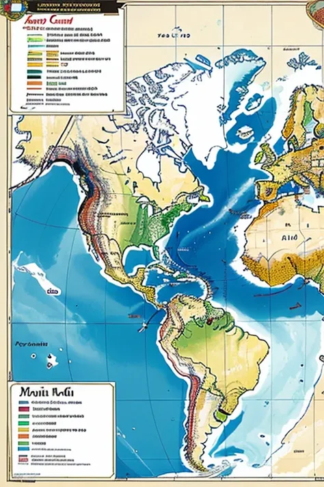
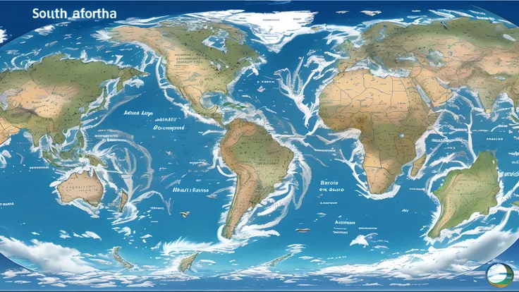
A map of the world showing the different types of water


Claro! COME ON! In the video, we can illustrate the El Niño phenomenon visually and explain its climatic consequences. We can start by showing a map of the Equatorial Pacific Ocean, highlighting the region where El Niño occurs. Em seguida, We can show an animation that represents the warming of the waters in this region, explicando que, during or El Niño, the waters of the Equatorial Pacific Ocean get warmer than normal. We can also show an animation that illustrates the changes in atmospheric circulation patterns caused by El Niño. Podemos representar as correntes de ar se deslocando de forma diferente do usual. Regarding climate consequences, podemos ilustrar cada uma delas separadamente. Por exemplo, We can show a thermometer rising to represent rising temperatures. We can also show a map with different colors representing the areas affected by rising temperatures during El Niño. Para as chuvas, We can show charged clouds and raindrops falling in different regions, to illustrate that El Niño can cause heavier rainfall in some areas and drought in others. Ademais, We can highlight the impact of El Niño on agriculture., showing wilted and dry crops to represent the lack of rainfall and the difficulty of cultivation during this phenomenon. No geral, The goal is to use visual elements, as animations, Maps and simulations, to explain in a clear and visually appealing way what the El Niño phenomenon is and what its climatic consequences are.
Prompts
Copy
Claro
!
COME ON
!
In the video
,
we can illustrate the El Niño phenomenon visually and explain its climatic consequences
.
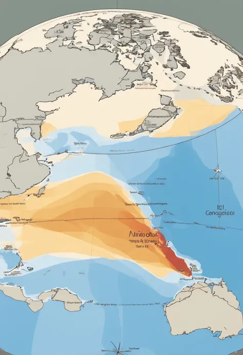
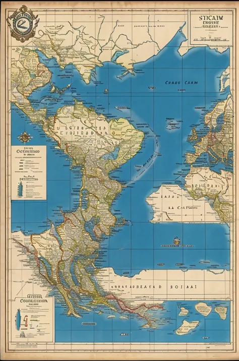
We can start by showing a map of the Equatorial Pacific Ocean
,
highlighting the region where El Niño occurs
.
Em seguida
,
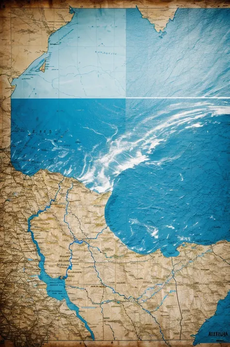
We can show an animation that represents the warming of the waters in this region
,
explicando que
,
during or El Niño
,
the waters of the Equatorial Pacific Ocean get warmer than normal
.
We can also show an animation that illustrates the changes in atmospheric circulation patterns caused by El Niño
.
Podemos representar as correntes de ar se deslocando de forma diferente do usual
.
Regarding climate consequences
,
podemos ilustrar cada uma delas separadamente
.
Por exemplo
,
We can show a thermometer rising to represent rising temperatures
.
We can also show a map with different colors representing the areas affected by rising temperatures during El Niño
.
Para as chuvas
,
We can show charged clouds and raindrops falling in different regions
,
to illustrate that El Niño can cause heavier rainfall in some areas and drought in others
.
Ademais
,
We can highlight the impact of El Niño on agriculture
.,
showing wilted and dry crops to represent the lack of rainfall and the difficulty of cultivation during this phenomenon
.
No geral
,
The goal is to use visual elements
,
as animations
,
Maps and simulations
,
to explain in a clear and visually appealing way what the El Niño phenomenon is and what its climatic consequences are
.
INFO
0 comment
0
0
0
SeaArt Swift AI Apps

AI Face Swap
Explore different identities and discover your new self with one click.

AI Image Upscaler
Make crystal clarity magic today!

Remove Background
Removes background through AI recognition

AI Text to Image Generator
Transform Plain Words into Stunning Art.

AI Makeup
The Beauty Formulas of a Million Makeup Artists

Sora Text-to-Video
Use Natural Language to Quickly Generate 60-Second Videos
Explore Our Swift AI Tools